height
Showing posts with label Collaboration. Show all posts

Friday, October 20, 2023

Tintoretto's Paradise

Tintoretto, Paradise (detail)


The version of Paradise that Tintoretto painted for the Ducal Palace in Venice in 1592 is reproduced above. It is referred to several times in the text of Five Wounds (although I never name the artist in the novel). It is also quoted visually in a diptych on pages 28-29. In the standard scholarly biography of Tintoretto, by Eric Newton, there is a long passage on the painting, which I sent to Dan as reference material. Starting on p. 198, this passage reads as follows.

The finished painting is, as it were, a colossal three-dimensional wall-paper, a vast pattern representing space itself, marked out in dark patches, between which one’s eye [199] seems to penetrate into a radiant, crowded infinity, as though innumerable groups and clusters of figures had arranged themselves like galactic systems one behind the other in the interstellar void.

At first glance this absence of formalized planes and, in particular, the lack of a base with a firmly established foreground, confuse and bewilder the eye, but gradually the brave pattern, with the noble silhouettes of Christ and the Virgin as its climax, asserts itself. One begins to see it as the only possible solution to the problem. .... The finished painting is ... governed by none of the normal optical laws. The effect is not of standing in this world and gazing into the remote distances of the next but of seeing through a glass wall into a celestial aquarium in which both light and distance mean nothing. Single figures and groups of figures float through this supernatural ether, towards or away from the glass wall, in a ceaseless rhythmic movement, not under the spell of gravity but in obedience to the magnetism that radiates from Christ and the Virgin who bend gently towards each other above them. The gaps between them are not areas of radiance but glimpses of interstellar space, and that space is not so much occupied by the myriads of the blessed as composed of them. The radiance in which they have their being has become interchangeable with their being itself. The world of visual experience with its vocabulary of ‘near,’ ‘far,’ ‘upper,’ ‘lower,’ ‘towards,’ ‘away from,’ no longer exists. This, in purely practical terms, gives Tintoretto the immense advantage of being able to enlarge or diminish any figure at will without contradicting the laws of perspective; it retains the medieval system of scale by importance without abandoning the Renaissance system of scale by distance.


Newton’s insistence on seeing the Paradise as the crowning achievement of Tintoretto’s career (he died in 1594) seems misguided, given that the painting is now usually attributed jointly to Tintoretto’s son Domenico, a much inferior artist, and to the workshop. With this revised attribution in mind, the peculiar composition seems less the result of unconventional artistic genius and more like incompetence, but this illustrates a more general point about the nature of interpretation, which is always the result of a series of enabling preconceptions. As Gabriella concludes in Five Wounds, an illegible message was easier to transcribe if one already had some idea of what it might say.

Newton starts with the presumption that the painting is by Tintoretto, and Newton knows that Tintoretto is a genius. Everything in his account follows from that basic premise. My own, admittedly uninformed, first impression was that it was rather turgid, whoever painted it, but that makes Newton's achivement in this passage even more impressive. It is a brilliant piece of creative writing, insofar as it succeeds in reinscribing this apparently mediocre work as a masterpiece. Even so, Newton's approach seems rather old-fashioned now (the biography was published in 1952), and not only because it is based on obsolete research.

Newton is a late descendant of a tradition of conoisseurship that goes back to Giorgio Vasari, who founded art criticism as an academic discipline in the sixteenth century, and in the process suggested what it is that critics should be doing. Vasari’s purpose was three-fold: to provide clear descriptions of paintings that, in an age before photographic reproduction, could often only be viewed in situ; to establish a set of criteria by which one could distinguish great painting from good, and good from bad; and to establish a canon of painters who, collectively, embodied those criteria.

Titian, Eleonora Gonzaga della Rovere

Vasari was perhaps the first major theorist of Western art, but one of the first important art critics in the same tradition was Pietro Aretino, whose literary output was far more varied and whose ideas on art were far less systematic, but whose letters and sonnets about Titian helped to establish the latter as one of the most successful painters in Europe in the middle of the sixteenth century. For example, Aretino described Titian’s portrait of Eleonora Gonzaga, Duchess of Urbino (above), painted c. 1536-8, as follows.

The union of colours laid in by Titian’s brush expresses, besides the concord that reigns in Eleonora, her gentle spirit. Modesty [modestia] is seated with her in an attitude of humility, purity resides in her dress, consciousness of her virtue [vergogna] veils and honours her breast and hair. Love fixes on her his lordly glance. Chastity and beauty, eternal enemies, are in her likeness and between her eyelashes the throne of the Graces is seen.

The flattery is obviously aimed at Eleonora as well as Titian, but its effect depends on the assumption that Titian’s painting displays her character rather than merely representing her appearance. According to Aretino, the painting opens a window into Eleonora's soul. Eleonora, the painting, Aretino's description: each of these things is, in some sense, identical with the others. There is no mediation. Everything is transparent.

Aretino claims to be ‘reading’ the portrait, but what he’s actually doing is interpreting it, and, as with Newton's description of the Paradise, reinscribing it: that is, writing meaning over it. I defy anyone to look at this picture unprepared and say, ‘I see the concord that reigns in Eleonora, her modesty, purity, etc., etc’. Aretino is trying to influence the way we read the portrait by annotating it, but at the same time insisting that his annotations add nothing that is not already there.

One way of clarifying this problem is to reverse the terms of the relation between word and image. Would someone who only had Aretino’s description of Titian’s portrait – or Newton’s description of Tintoretto’s Paradise – be able to visualise the paintings in question accurately on the basis of the description alone? The answer is surely, ‘No’.

I am interested in this question for practical reasons, because my collaboration with Dan involved writing descriptions of pictures that did not yet exist, which Dan then used to bring these potential pictures into actuality. In this case, the description generated the picture, rather than the other way round, but that actually makes the role of interpretation more explicit. Dan’s illustrations were always a loose translation of my instructions, inevitably, because they were rendered in a different medium by a different process and via a different sensibility. They always added something to the written description, no matter how exhaustive my instructions aspired to be. So I could never predict what they would look like.

One might argue that Dan was doing the same thing that Newton and Aretino were, but in reverse. I think it's a bit more complicated than that. We may see Tintoretto's and Titian's paintings in a new light as a result of their efforts, but Newton and Aretino are not actually attempting to open a conversation: rather, they aim to have the last word. The painter, or rather the painting, has no right of reply. In the classic version of connoisseurship, the definitive interpretive act is an attribution: 'Yes, this painting is an authentic Tintoretto'. But the authority of that attribution derives not from Tintoretto himself, who lacks the insight to understand his own talent (Tintoretto does not know what it is that makes him Tintoretto), but from the disinterested mind of the connoisseur.

What I was doing, by contrast, was inviting Dan to alter the meaning of my work, to divide the responsibilities of authorship with me (quite literally in the case of Five Wounds).
Five Wounds: Photographs and Etchings

[The discussion below continues from two previous posts: one on 'Tone and Line', and one on 'The Making of Five Wounds' ]

Because of my experience as a photographer, when I came to write instructions for Dan for the illustrations for Five Wounds, I had a default aesthetic in which maximum definition of detail, low contrast, and a long tonal scale were important values. This photographic aesthetic led me to misinterpret certain aspects of Francisco Goya’s etchings, which Dan and I used as a common point of reference in the early stages of our collaboration (a couple of examples from Goya's series Los Caprichos are reproduced below).

Francisco Goya, Los Caprichos, Plate 21

Francisco Goya, Los Caprichos, Plate 64

Etchings are a reproduction technique based upon drawing, but Goya’s also use acquatint, which deliberately introduces random ‘noise’ into their backgrounds. Areas that might, in a different kind of image, be represented as an undifferentiated, empty field, or as cross-hatched, murky shadows, are instead broken up by the application of acquatint, which creates an irregular textured effect, as in the examples above. I did not actually know what acquatint was when Dan and I began to work on Five Wounds, but I could nonetheless see that Goya had flattened the tonal scale by breaking up the backgrounds of his images with the visual equivalent of static. The only analogy I could think of was film grain in photography.

It did not help that the editions of Goya I consulted were printed at a lower contrast than the original etchings (this is not the case with the samples above, which are more accurate reproductions). Reproductions of etchings in modern books usually involve their conversion into half-tones via photographs of the originals. Getting thick blacks in a printed book requires heavy paper to hold the requisite amount of ink, and multiple passes through the press to build up the densities (in some cases, it may also involve the addition of other colours into the black areas, to create a so-called 'rich black'). Conversely, the white end of the tonal scale is represented by whatever the paper base is, and in cheap editions this is invariably a dirty grey rather than a bleached pristine tone. Cheaper, mass-produced images therefore almost always sacrifice accurate representation of tonal values for budgetary reasons, but I did not realise this, and so I thought that the flat contrast was an effect intended by Goya.

The first set of images that Dan created for Five Wounds were the ‘Plates’, and my scripts for these were heavily influenced by my misinterpretation of Goya, as mediated through my experience as a photographer. I therefore asked for an oppressive, clinical accumulation of detail, almost like a Pre-Raphaelite painting, except with the opposite emotional effect, and I wanted a flattened tonal scale that corresponded to a flattened emotional response: that is, to the experience of trauma, which results in an inability to organise memories effectively (that is, an inability to suppress irrelevant information, to forget).

I also conceptualised the desired compositions in photographic terms. So I often asked Dan for either ‘telephoto’ or ‘wide-angle’ effects. The former implies a flattened perspective, a compressed representation of space that makes it difficult to separate near from far; the latter, by contrast, implies that space is opened up via abrupt recessions and violent changes in scale between the foreground and background. Wide-angle compositions are inherently melodramatic; telephoto compositions create a feeling of constraint. Mostly, I wanted telephoto effects. But the most explicit manifestation of this collision between two different aesthetics was that I asked Dan to incorporate pseudo-photographic textures into his drawings.

Many of these textures are used to suggest that the physical integrity of the image itself is breaking down, but in a radical sense: that is, in these images, the medium of drawing itself cannot maintain its integrity as a specific technology of representation, and it is therefore 'contaminated' by photography. Hence my scripts for Dan jumbled up picture references from works on the conservation of etchings, and those on daguerreotypes (an early photographic technology that is referenced extensively within the text of the novel), but – somewhat perversely – in both cases I only copied those images that illustrated what happened when things went wrong.

Several of the Plates therefore have pseudo-acquatint effects as well as pseudo-photographic textures, and they have a long, soft tonal scale, with minute accumulations of detail. Ideally, I wanted the viewer to be able to go over them with a magnifying glass.

Plate 14: Dust, dynamic

For example, I'll Huff and I'll Puff ..., above, includes acquatint effects in the background, which are here given a kind of diegetic justification within the picture space by analogy to the event depicted in the foreground, which shows Crow blowing a handful of dust towards the recumbent Magpie. In the novel, the dust represents the relationship between signal and noise in information theory (among other things). In fact, there are two 'clouds' of dust in the image here, representing the exhalations of the two characters shown, one cloud contained within the other, and both contained within the surrounding aura of the textured background. In other words, there is no clear conceptual separation between object and field, an idea I took from photography, and from Goya's use of acquatint.

The figure of Crow on one knee from Plate 14 is cloned and placed at the centre of the subsequent ... And I'll Blow Your House Down, reproduced below, which depicts the destruction of the ducal palace in Venice by means of an explosion, in a development inspired by Guy Fawkes. The use of concentric circles in the composition is a reference to Tintoretto's Paradise (which is also alluded to in several other illustrations). The reproduction of Crow's draws a visual analogy between the exhalation of breath in the earlier images and the violent, massive displacement of air in the explosion here, an analogy underlined by the image titles.

Plate 16: Bang!

The level of detail and the minute variations in textural effect that Dan worked into the Plates is probably not apparent in these online reproductions, but it may be observed from a magnified detail, appended below.

Detail from Plate 16: Bang!

As might be expected, the photographic aesthetic I had in mind sometimes 'clashed' with Dan's instincts as an artist. As a result, he sometimes ignored (or perhaps creatively misinterpreted) my instructions. Dan seemed to prefer chiaroscuro effects and what I would describe as wide-angle compositions, but in editing these images, I would often ask him to break up areas of undifferentiated tone with noise, or to add additional layers to an image, to build up a sense of compression.

The final version of Cur’s first murder, followed by the draft, reproduced below, indicate this conflict – or rather ongoing dialogue – clearly. Note that, in this image, as in several others, the ‘effects’ (the textures that mimic picture damage) are both ‘inside’ and ‘on top of’ the image: they exist in both the picture space and on the picture plane, and, as I suggested above, one of their purposes is in fact to obscure this conceptual distinction, as the accompanying text obscures the distinction between realist narrative and allegory. The 'effects' therefore apply most visibly to areas of the image that would otherwise be rendered as either pure white or pure black.

Plate 2: Cur's first murder

Corrections to Plate 2

When we moved on to the later stages of the collaboration, and in particular to an entirely separate set of illustrations, which are integrated into the page layouts, Dan switched techniques. In contrast to the plates, these later images embrace the limitations of drawing, and revert to its binary system of black line against a white field. This was a logical extension of my intention to give Dan greater creative autonomy in this phase of the collaboration: that is, he was no longer under any obligation to mimic photographic effects, or to conform to my aesthetic expectations. Below are a couple of these 'pure' drawings, which have a quite different feel to the Plates, emotionally as well as technically.

Cur and the black dog

Cuckoo the trickster

Five Wounds: The Making of

Following on from the previous post, this one has more detail on the collaborative process involved in the creation of Five Wounds.

Dan and I met in Cambridge in 2001. I was a postdoctoral researcher at Cambridge University. Dan was studying for a degree in illustration, and was working in a comic shop, where he took my order for a copy of Alan Moore’s The League of Extraordinary Gentlemen. Here are some other salient facts: 

1) Our collaboration works entirely by e-mail correspondence. Since 2002, we have only been in the same place once: in London in 2006, when we spent most of the afternoon walking around trying to find a screening of Mirrormask by Dave McKean and Neil Gaiman. We failed. 

2) Dan is probably the only person capable of interpreting my weird scripts. Scientific research has proven that they cause migraines and disorientation in other illustrators. 

3) Dan created the illustrations for my first book, Pistols! Treason! Murder!, which is about a real-life Venetian spy, who was executed for perjury in 1622. These illustrations are all in the style of seventeenth-century allegorical woodcuts. 

4) As a child, my bedroom was full of half-assembled model aeroplanes; Dan’s was full of insects in jars. This seems somehow significant. 

Dan and I began with a shared interest in comics, which offered a set of guidelines for how it might be possible to work together. Mainstream comics companies operate by means of a highly specialised division of labour, not only between writer and artist, but between writer, penciller, inker, colourist and letterer, et al – a system that was probably inspired by the factory assembly lines of Henry Ford rather than by any sense of its creative potential. The goal was to maximise efficiency for an industry in which the turnover of product was very rapid (weekly or monthly), and insofar as there was a coherent creative vision involved, it was arguably that of the editor, whose role in the process was analogous to that of a Hollywood producer. 

Even so, one may adopt analogous, if rather less rigid, divisions of labour for reasons other than industrial efficiency: for example, a conviction that collaboration, if entered into in the right spirit, will inevitably increase a work’s range and power. It was important that Dan was trained as an illustrator – that is, in a discipline that accepts collaboration as a sine qua non of its existence – because the goal for any collaborator should not be to protect the integrity of their individual contribution; rather, it should be to serve the story and the book as a whole. 

For me, faced with the task of writing a script for Dan to work from, the central question was, how do you describe a picture that doesn’t exist yet? And how do you relate that description meaningfully to other descriptions of other pictures that also don’t exist yet? The ancient rhetorical convention of ekphrasis suggests some historical answers to this question, but more recent practical help was available via several examples of published scripts for comics

The earliest set of illustrations created for Five Wounds were the plates, which are included in the printed book as separate pages at the end of several chapters. I wrote hundreds of words of instructions to Dan for each of these. Below, for example, is the script for what is now the first of these plates, Initiation, and which concerns a character called Cur. Dan had of course already read the novel when he received this script, but for blog readers, some additional contextual information might be helpful. 

In Initiation, then, Cur has been kidnapped by dogs, and is being introduced to their group in a quasi-magical ritual. Also of relevance is an earlier incident, in which chickens were killed by the dogs as one of them bit three fingers from the hand of Cur’s father. In my script, both the chickens and the fingers are transposed to the later scene, and the fingers also ‘stand for’ three of the other protagonists of the book, who are identifiable by coded references to heraldic colours superimposed on the different fingers.

Hence this script instructs Dan to synthesise a number of scenes from the written narrative, and also to make certain ideas explicit visually that remain implicit in the text.  

SCRIPT FOR INITIATION 

A straight down overhead shot and a ‘non-literal’ pic. A wailing, crying baby Cur is lying on his back at its centre (relatively small within the frame). Underneath him are the internal lines of a pentangle in white. It will be clear from another illustration that each of the points around the pentagram stands for one of the book’s five protagonists. The sequence (running clockwise and starting from the upper left) begins with Gabriella, then Cur (the subject of this image, whose nominal assigned place is at the apex of the pentagram), then Cuckoo, Magpie and Crow. 

The left arm of baby Cur is reaching out, grasping in the direction of Cuckoo’s point on the pentagram. Around baby Cur, the pile of overlapping, slaughtered chickens will be laid in a circle along an implied outer circle, to convert the pentagram into a pentacle. Outside this circle are three severed fingers (the middle, the third and the little respectively). You should over-size them dramatically; that is, put them at a different scale to that used for Cur and the chickens (this is not apparent on my sketch). You’ll probably also need to exaggerate the nails and possibly the joints to make it clear what they are – maybe use a blood stain where they end too. 

The fingers are to be cross-hatched in the appropriate heraldic tones: checks for black Cuckoo, towards whose finger Cur’s left hand seems to be grasping, while his right hand lies open and passive in the direction of where Gabriella’s shield would implicitly be; a blank white third finger for Magpie, and a dotted little finger for Crow. Cur’s feet appear to be kicking against the latter two as he wails and cries. 

The severed fingers should be curled over and placed casually in roughly the right place, but not geometrically aligned or pointing inwards toward the centre. 

Cur’s tears could be highlit as blank white trails to contrast with a full black trail of blood down his face that is placed at the central point in the shaving scene pic

Outside the first circle of chickens that occupies the position of the pentacle circle is a second, looser circle of intertwined dogs, of different breeds and in different postures. They don’t all have to be huge and grim and black, but no Yorkshire terriers or Chihuahuas please. Their coats should be shaded using different ‘pasted on’ corruption effects (one for each dog). 

These two circles (the inner chicken one and the doggy outer one) foreshadow the two circles of the exploding palace illustration (which in turn reference Tintoretto’s Paradise in the ducal palace). 

Reduce the outer circle to four partial arcs, one in each corner. The dogs in the circle are not seen realistically from overhead, but from varying partial viewpoints, whatever is most useful to get an intertwining effect. Lots of emphasis on teeth and tongues please. 

Fill any empty space with ‘effects’, which here should emphasize fluid, flowing, overlapping stains and discolourations: that is, they should resemble water damage, since Cur recalls this experience in later life by way of a dream of drowning.  

I also drew a crude storyboard sketch to accompany this script, which I reproduce below (click to enlarge).

Storyboard Sketch for Plate 1

Since putrefaction and decay are major themes in the book, many of the Plates are marked with signs of their own physical degradation. The term ‘effects’ in the script therefore refers to these signs, which, in this case, Dan created using coffee and tea spilled on paper. Can you predict what the finished image might look like on the basis of the script above and the sketch? This was Dan’s task: to first imagine that image, and then to create it. Below is the result.

Plate 1: Initiation  

Above: Plate 1, Initiation, from Five Wounds (click to enlarge)

Some images went through several drafts, not because of any deficiencies in Dan's execution, but because I struggled to think clearly about what the proper relationship between image and text should be, or in what way precisely the image should embody broader themes from the book. 

Below, for example, are the initial instructions for what eventually became Magpie in the forest, followed by successive revisions of the image itself, the latter interspersed with selections from my e-mails to Dan. 

 SCRIPT FOR MAGPIE IN THE FOREST 

A track through a forest (Goya trees and shadows around Magpie).). A bat above, foreshadowing the incident with the first daguerreotype. We are looking at Magpie from the side and in long shot. He is holding a mirror reflecting the moon, the same mirror that Cuckoo holds in Plate 6, Cuckoo’s reflection, but Magpie is much less dominant within the frame than Cuckoo is in Plate 6. 

Magpie is dwarfed within the skeletal, snowy landscape of trees, which are layered and compressed on different planes. He is almost lost or tangled up among the tree branches, which overlap in front of him and partially obscure him, but his head, cloak and mirror remain clearly visible, as do the sky, stars and moon in the upper third of the frame. He appears within a small break in the trees (see reference pix from Blankets and Black Hole for this effect). 

The moon should be absolutely realistic and as detailed as possible, but ‘solarized’ at its upper edge as the black sky bleeds off into ‘deteriorating daguerreotype’ effects. The moon in the mirror is miniaturized but clearly recognizable. The snow falling and in drifts between the bare tree outlines allows you to rhyme the dappled effect on Magpie’s face with black and white tonal variations in the landscape. 

Compare the Blankets pix for how to show snow, dark forest and highlit figures within. There are also various good dark forest shots in Black Hole (without snow). I attach a fantastic snow effect scene from Sin City, although note that a lot of Miller's effects rely on his omission of half-tones: i.e. everything is either pure black or pure white in each frame, which is a quite different technique to that I want for the Plates, where the tonal range is longer and flattens off towards the two extremes.  

Try and keep some the textural detail of the folds of the cloak, but have the cloak down instead of up.

Plate 10 - Version 1  

Plate 10: Version 1

E-mail dated 18 May 2006: We need a daguerreotype version of the moon, not a drawn one. For the 'solarized' effect, you may need to create a smoother texture than is possible with pen and ink, using cloning in Photoshop with a dull metallic dark grey. Anyway, see what you can do. Also, too chiaroscuro. Flatten out the midtones by adding a background layer of mid-tone grey in Photoshop.

Plate 10 - Version 2  

Plate 10: Version 2

E-mail dated 2 June 2006: Lose the bat and close up the cross-hatching where it currently is. Also, I think we need a bit more snow, especially in the central and lower areas, where it is more or less absent. You could have another go at getting an effect whereby the snow is both a distinct layer ‘on top of’ the picture space, but also continues inside the picture space and blends into a corrupt background, although I appreciate that this may not be possible. 

In addition, Magpie's left hand (the one not holding the mirror) needs greater definition of form. It is currently a bit amorphous and not very hand-like.  

E-mail dated 2 June 2006: It took me a while to register that your moon is rotated ninety degrees. The effect of this is actually rather interesting. It is completely 'wrong' from an astronomical point of view, since the moon is never lit from below but always runs through its phases along the vertical axis, and in your version its features are also all in the wrong place (for an astronomer, it will be like seeing the globe tilted ninety degrees on its axis). However, I think that perhaps it's a nice way of signalling on a subliminal level that there's something not quite right or logical about the world of FW. Everything is a bit skew-wiff - as the moon is - so in that sense it's 'right', and I'm inclined to leave it alone.

Plate 10 - Version 3  

Plate 10: Version 3

E-mail dated 8 June 2006 The grey layer is (as I read it) 'behind' the black outlines of the trees and the sky above. Add some grain / white specks, etc. to it – another different representation of snow – but this should not interfere with the black ink that makes up the tree shapes and shadow outlines or with the black sky and the moon above. 

If we divide the picture up into blocks and layers of tone and completely ignore the perspective and recession, it breaks down into: 

Foreground / top layer: drifting snow and moon 

Midground / middle layer: sky, black outlines of trees and their shadows below, Magpie in middle 

Background / bottom layer: layer of amorphous grey tone 'underneath' the drawn outlines (most clearly visible as such in the space immediately surrounding Magpie) - to which add white specks / grainy interference. 

Does this make sense? Hopefully it does. 

There were some further adjustments to the moon in the top left. The final image therefore looks like this.

Plate 10: Magpie in the forest  

Plate 10: Final Version

As a final twist in the production process, the written scene that originally inspired Magpie in the forest was actually removed from the manuscript during the structural edit. However, since I liked the image so much, I invented an entirely new scene, whose sole purpose was to provide a textual justification for the continued existence of this plate. Indeed, I frequently rewrote sections of the novel in response to Dan’s work, because the illustrations often clarified ideas that were insufficiently developed in the text, or brought things to my attention that had not occurred to me during writing. 

In retrospect, the level of detail in the scripts I wrote for the plates, as sampled above, seems excessive, although the obsession with control betrayed by this accumulation of detail had interesting aesthetic consequences. All the plates feel cramped and constrained, lacking in spontaneity (natural enough since many of them went through several drafts), but this feeling accurately reflects the world that they describe and the state of mind of the characters they depict. 

In later phases of our collaboration, however, when Dan and I had both gained confidence, my instructions were far less prescriptive. The feel of the later illustrations is therefore quite different from that of the plates, which helps to vary the tone and rhythm of the book’s visual elements. Some examples of these later scripts and illustrations can be found on Dan’s blog, where he discusses their creation from his own perspective: Jean in the Jar, The Black Dog, and The Bagatto

I look forward to seeing where our collaboration will take us next.

Five Wounds: An Anti-Historical Novel, Part 2

[Historians] have always … written in the mode of magical realism. In strictly formal and stylistic terms, a text of social history is very closely connected to those novels in which a girl flies, a mountain moves, the clocks run backwards, and where (this is our particular contribution) the dead walk among the living.  

Carolyn Steedman, Dust, p. 150  

This was a psalter in whose margins was delineated a world reversed with respect to the one to which our senses have accustomed us. As if at the border of a discourse that is by definition the discourse of truth, there proceeded, closely linked to it, through wondrous allusions in aenigmate, a discourse in falsehood on a topsy-turvy universe, in which dogs flee before the hare, and deer hunt the lion.  

Umberto Eco, The Name of the Rose, p. 69  

In an earlier post, I described Five Wounds as an ‘anti-historical novel’. It relates to early modern Venice, the subject of my historical research, in much the same way as the marginalia in an illuminated manuscript relate to the sacred text that they accompany: except that in this case the sacred text, which alone justifies the marginalia, is absent or has been rewritten in a profane form. Here, then, the marginalia are promoted to the centre of attention, where they blasphemously assume the outward form of Scripture (I mean that the text is typeset in imitation of the Bible). 

In the quotation from Umberto Eco above, the topsy-turvy world in the margins is related to the central reality of Scripture through the lens of mockery. Mockery also has a central place in Five Wounds, but violence is an equally important organising principle. So the novel literally describes a violent world, in which mutilations and murders are commonplace, but that violence is not restricted to the events described in the plot. The novel’s mode of representation is also violent, in that it deliberately misrepresents historical sources: it forces them to say things that they did not intend. 

The action of Five Wounds is set in an unnamed city that is obviously a version of Venice, but is equally obviously not the historical Venice. Rather, it parodies selected aspects of that historical context, in a manner that sometimes draws upon the so-called ‘anti-myth’ of Venice, in which the Venetian state is portrayed as a corrupt, disguised tyranny rather than a virtuous, transparent republic (the anti-myth also underlies my first book Pistols! Treason! Murder!, which is a biography of a Venetian spy). In Five Wounds, there are also numerous garbled references to Venetian topography, including (notably) the Ghetto, which is here occupied by dogs, and is on the site of an abandoned foundry, this last taking up an etymological speculation about the origin of the word, ‘Ghetto’, and rendering it literally. If Five Wounds is set in several different historical periods simultaneously, as I suggested in that earlier post, then perhaps we might ask, Which, and in what proportion?

Much of the setting seems to be, roughly, mid-nineteenth century: dagurerreotypes, gas lighting, top hats. But some people wear eighteenth-century-type clothing. And the city's constitution parodies that of the Venetian republic, which ceased to exist in 1797. With regard to the book’s conceptual universe, there are references to theoretical arguments put forward by a variety of early modern thinkers, for example Machiavelli and Paracelsus; to early modern theories about the physiological origins of anger and rabies; to Neoplatonic debates on the meaning of hieroglyphs (which are garbled interpretations, based on erroneous premises); and so on. Moreover, a large painting of Paradise in the ducal palace, based on one created by Tintoretto (or his son and workshop) in the late sixteenth century, is newly painted and installed in the novel.

Similarly, some of the more complex illustrations (the plates, which appear at the end of selected chapters) incorporate photographic elements and textures into images that otherwise resemble etchings: that is, they superimpose two quite different image-making technologies.

This game of historical mix-and-match bears some resemblance to what anthropologists and cultural theorists call ‘bricolage’, a sort of ‘do-it-yourself’ attitude to culture, in which a world is made out of borrowed odds and ends, which are put to use without much interest in their original or intended function. Bricolage replaces the idea of misinterpretation with that of appropriation. Misinterpretation presupposes an original meaning that retains priority over all subsequent readings. It excludes unbelievers and heretics. By contrast, appropriation permits anything. It knows no sin. Its only law is, 'Do what thou wilt'. 

I remain committed to the idea of misinterpretation, if only because a world without sin - without laws - is profoundly boring. We are told that it is possible to deconstruct any literary text: to force it to the point of self-contradiction. But Five Wounds positively invites you to do this. It it does not really make sense, and in particular it does not make sense when considered from a historical point-of-view, but it is not even internally consistent. 

This superimposition of contradictory references is also apparent in the plot, which culminates with two alternative endings, a state of affairs that is foreshadowed throughout the book, especially in the illustrations. Thus the hand icon on the cover, which is inspired by an illustration from a seventeenth-century treatise on palmistry, presents to the viewer mutually exclusive readings: that the bearer will live long, and die young; that he will die by fire, and by drowning; and so on.

Five Wounds Hand

Above: the Five Wounds hand

This doubling  to a character named Cuckoo, who is, in certain respects, the central figure in the book. He is a gambler with a face made of wax, which he manipulates freely. It is his fate that is at stake in the two different endings, and he is therefore represented as doubled in several images, i.e. as a copy of himself. At the heart of this fictional world, then, there is a vacuum. Everything it requires to sustain stable meanings has been erased, or is ‘under erasure’ - simultaneously asserted and denied, like a phrase that is crossed out but still remains visible - a condition that is again alluded to in the person of Cuckoo, who is always represented in the illustrations with his face scratched out.

Cuckoo the trickster  

Above: Cuckoo the trickster

What is the point of all this? It is an attempt to explore the limits of historical explanation by violating all of its essential preconditions. It is also an exploration of the nature of interpretation. As such, Five Wounds opposes a book like The Da Vinci Code, which does not admit the possibility of error in interpretation. In The Da Vinci Code, this means this, and that means that; therefore this, with all the seductive inevitability of a false syllogism. In Five Wounds, mistakes are what drive the plot, or rather, the characters never know whether or not their interpretations are correct.

Even blasphemy admits of too much certainty. Self-contradiction is the only honest strategy.

[All illustrations are by Dan Hallett.]

Friday, October 27, 2017

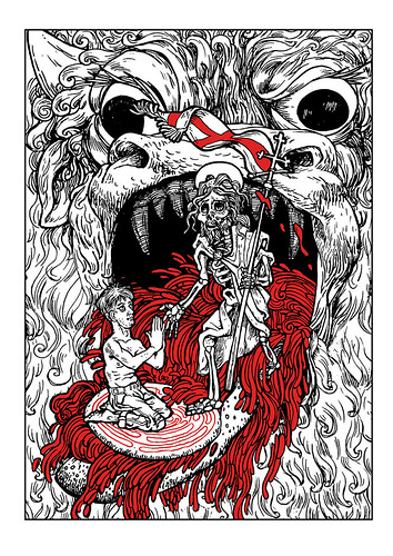
Second Illustration for Brethren

BRETHREN 2

Here is a second illustration by Dan Hallett for my novel Brethren. Below is the script I initially sent to him:

Script for Dan

The second illustration is based on the iconography of the ‘Harrowing of Hell’. This legendary event purports to explain what Christ did between his death and resurrection: he went down into hell, to release the Old Testament patriarchs from limbo, and possibly preach to and rescue other ‘spirits in prison’. It was a popular story in the Middle Ages, via a compilation called The Golden Legend, and / or Latin translations of the original source, the so-called Gospel of Nicodemus (a late-classical fake).

Are you on Pinterest? There are some useful collections of medieval and early-modern visual representations there, e.g.: https://uk.pinterest.com/revjoelle/harrowing-of-hell/?lp=true

There are two basic ways of representing hell in these images: as a devouring mouth, or (seemingly much less common) as a walled city. In the former style, the mouth gapes open, and Christ seems to reach inside and lead people out by the hand. In the latter, he ‘besieges’ the gates of hell, and breaks them down, perhaps by striking them with his staff / ensign (which has the same St George’s Cross as the Agnus Dei).

In the Gospel of Nicodemus, there’s some suggestion Satan lets Christ into hell willingly, thinking Christ is defeated, not realising he’s bringing in a Trojan horse. In ch. 14 of Brethren, Jenny suggests that hell swallows Christ, but then vomits him out, because it can’t keep him down. I can’t find any visual suggestion of this last idea—perhaps because it’s too irreverent—but it echoes the story of Jonah and the whale, which was interpreted as an allegory of Christ’s death, i.e. Jonah in the belly of the whale is Christ in hell.

In keeping with the emphasis on the body in Brethren, we’re going to show hell as a mouth rather than a city. The mouth / face should have horns, and should vaguely (but not explicitly) suggest the head of a weird, demonic bull (because in the book hell is also depicted as the Minotaur / the bull-headed god Moloch). The pic will show a Robert / Everyman figure kneeling inside the mouth, hands clasped in prayer. But he’s not kneeling directly on the red tongue. Instead, he’s on a round, white communion wafer, which sits on top of the tongue. Hell is either about to try to swallow this wafer, or is in the process of vomiting it back out, but in any case, it’s sticking its tongue out, as if at the doctors.

Communion wafers are sometimes embossed with Christian symbols, one of which is the Agnus Dei (the image is also invoked in the words of the mass at the consecration of the host). Our wafer will instead by inscribed with the pattern / shape of the Chartres labyrinth from the first illustration, with Robert positioned at the centre. Not sure what this necessitates regarding the relative scale of Robert / wafer / hellmouth, but see if you can figure it out.

Re: the labyrinth pattern on the wafer. Don’t attempt to draw the path with two separate ‘sides’ enclosing a central space, as in the first illustration. Just do it as a single red line, to make it easier to draw at a smaller scale.

People in hell are always naked, so the only period indicators in medieval illustrations are in the general artistic style for human physiology (medieval faces often look a bit gormless to me)—and haircuts! But since this is (sort of) Robert, who at this point in the story has been hacking his own hair off with a pair of scissors for the past several years, his hair won’t be noticeably 80s in style. He’s also described as wearing dirty jeans in the final couple of chapters, so give him those too, but he’s bare-chested and barefoot. Robert’s ears are described as sticking out like Prince Charles in an early chapter, so give a suggestion of this, but don’t emphasise it too much, because we want to keep the dual significance whereby he stands for Everyman as well as himself (he should seem like a type rather than an individual). He should nonetheless look very much the worse for wear: bony and thin, but also a bit misshapen. He’s approx. 27 years old.

Christ stands outside the hellmouth. He’s carrying an ensign with the same design as the one in the scapegoat picture, and he has a halo. He is wearing a cloak with a shoulder brooch, as he is often represented. However, his body and face appear as that of a skeleton, like those which feature in a Dance of Death. It shouldn’t be a clean skeleton either, but one with tufts of hair, and gobbets of dried flesh and skin. Like these late-15th century examples: https://remedianetwork.files.wordpress.com/2013/01/dance-of-death.png

Skeletons in the Dance of Death sometimes have a jaunty or irreverent or mocking air. We don’t want that. This Christ skeleton should be serene and authoritative. It should also be drawn at a larger scale to Everyman / Robert, and it’s reaching down to offer its free hand for Robert to take.

Around the wafer, the hellmouth is vomiting up a flood of red wine (the blood of Christ, to accompany the body of the host). Perhaps the wafer is even floating on the flood, being carried forward out of the mouth, so the wafer’s like a raft for Robert—if you can make that work.

N. B. No demons in this hell: only the mouth.

I initially thought of having the hellmouth spewing its guts up, so that they flow around Robert and the wafer, and the coils of the guts would suggest (but obviously not directly reproduce) the shapes of the labyrinth, which in the text of Brethren is implicitly compared to both the inside of an ear and the packed cavity of the intestines. In the pic, Robert would then also be at the centre of this alternative labyrinth of guts. I don’t think this will work—it may not be obvious what the spilling guts are, or why they’re there, plus it will make the picture too busy. It’s better to keep the focus on the wafer and wine (the body of Christ inside the body of hell), but I mention it so you’re aware of some of the broader thematic issues, i.e. the association between hell and the (disintegrating, putrefying, turned inside-out) body.

Postscript

Dan did not draw Christ outside the hellmouth, reaching in to draw Robert / Everyman out. Instead, the dead Christ is inside hell, with His foot on the wafer that represents His resurrected body, which is on its way out of hell. This actually works better thematically.

Looking at the finished illustration, I thought it would not be obvious to the viewer that Robert / Everyman is kneeling on a giant communion wafer, so I added the following clarification to the end of the written text of the novel (the first illustration with the bisected goat is currently placed as a frontispiece, and this one as an endpiece):

Bill Forester once said: we remember a dead Christ, but our communion is with the risen Christ. Robert imagines a communion-wafer boat bobbing out of hell on a tide of wine. Because hell swallowed the dead Christ, but vomited up the risen Christ.

Then Christ swallowed hell.

Wednesday, June 21, 2017

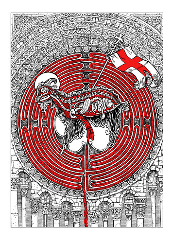
Brethren

Brethren Sample Illustration 


I have nearly finished a new novel, Brethren. I am now thinking about possible illustrations for this novel. As usual, I am collaborating with Dan Hallett to create a few samples for publishers, who can then decide if this is something they would like to see more of. The picture above is the first such sample. The rest of this post is a simplified account of the creation of this illustration, including: some general notes I wrote for Dan to introduce the novel; a short extract from chapter 15; and a script for this particular illustration.

General Notes for Dan

Brethren is set in evangelical Protestant church (the Brethren are a particularly austere non-conformist group). So my original idea was that its depiction of angels and demons would be rigorously Protestant, and use only Biblical sources. This is important because most of our ideas about demons, and some of those about angels, actually come from the New Testament Apocrypha (i.e. works judged unreliable by the early church) or the similar Old Testament Pseudepigrapha. But Robert’s theories about angels are taken solely from the canonical books of the Bible, which leads him to rather different conclusions to those of Christian traditions informed by these other sources.
However, Brethren is also a horror story: that is, a story in the Gothic tradition, in which the protagonist is haunted by repressed secrets. And one of the ideas behind the Gothic as it emerged in eighteenth-century novels is that England is similarly haunted by its medieval past: that is, by its Catholic past. The ruined monasteries and abbeys and castles that were the settings for Gothic fiction were ruined because of the destruction caused by Henry VIII’s reformation.
So my protagonist tries to construct an austere Protestant system of belief, but he’s haunted by Catholic ideas, which seep into his visions and experiences: e.g. transubstantiation (the idea that the bread and wine somehow become the actual body of Christ during communion), and the Harrowing of Hell (the idea, derived from the so-called Gospel of Nicodemus, that Christ preached to the imprisoned spirits in hell between his death and resurrection). I also draw on late-medieval Catholic sources like morality plays, in which the soul of Everyman was besieged by demons and angels; and medieval characters like Joan of Arc (who was visited by saints and angels).
So I want the images to have a late-medieval, Catholic feel, with a visual style from the 15th and early 16th centuries (i.e. just before the Reformation), but (if and when they include human figures) these will be dressed in 1980s clothes (I have some photos I can supply for reference, but they’re not necessary for this particular illustration). I was thinking of an engraving style, but really, if we’re talking 15th century, woodcut is more appropriate (and will probably be easier to do).
The sample illustration is based on the idea of the scapegoat from Leviticus in the Old Testament, which is discussed in chapter 15 of the novel. The relevant extract is appended below. Robert, the main protagonist, is the only one who can see or hear the ‘girl’, a.k.a. the demon Azazel. His friend Tracey’s there for moral support, as is Jenny, who’s an R.E. teacher with a background in theology. Mark’s an autodidact lay preacher. He’s the one actually performing the exorcism.

Novel Extract

‘My name is Azazel,’ the girl says.
Robert copies her. ‘Az-a-zel.’
‘What does that mean?’ Mark says. ‘Who are you?’
‘Ask Jenny,’ the girl says. ‘She knows.’
‘Jenny knows what it means.’
‘Me? I’m not …’ Everyone looks at her. ‘Fine. It’s from Leviticus. The ritual for the Day of Atonement. It might not even be a name.’
‘It’s my name,’ the girl says.
‘We don’t have theological discussions with demons,’ Mark says. ‘They’ve got nothing to teach us about God.’
Jenny pulls her bag out from under the chair, and gets her Bible out. She places it on her lap. ‘Maybe it’s something Robert needs to tell us.’
Mark says, ‘Well, there’s no harm in reading from God’s Word. But I’m not having a demon explain it to me.’
‘Take your time,’ the girl says. ‘Talk it over.’
‘On the Day of Atonement,’ Jenny says, ‘the High Priest stood before the Ark, in the presence of God. But first he had to make a special sacrifice.’
‘Nothing to do with demons,’ Mark says.
‘So he took two goats, and he cast lots between them.’
‘That’s you and Tracey,’ the girl says to Robert.
‘One goat for God; the other … for Azazel.’
‘It doesn’t say that.’ Mark gives in and goes to get his Bible from the top of the dresser on the other side of the room. He gives the bed a wide berth.
‘You won’t find it in the NIV,’ Jenny says. ‘Or the King James. Or the Living Bible. They all translate it. But they’re guessing, because no-one knows what it means.’
‘I do,’ the girl says.
Jenny says, ‘In Hebrew, it’s something like “taken away”; “removed”.’
‘Exorcised,’ the girl says.
‘In the Greek version of the Old Testament, it’s “a thing that keeps illness away”. Like a charm.’
‘Except not like a charm at all,’ Mark says. ‘Because that would be the occult.’
‘In the Latin Bible, it’s caper emissarius. Messenger goat. Scout, spy.’
‘Angel,’ Robert says.
Jenny flicks through her Bible to Leviticus. ‘In English, it’s usually scapegoat, but Tyndale invented that word in 1530 for his translation, and everyone else copied him. Except the RSV.’ She reads, ‘The goat on which the lot fell for Azazel shall be presented alive before the Lord to make atonement over it, that it may be sent away into the wilderness to Azazel.
‘So the High Priest sacrifices one goat; sprinkles its blood in the Holy of Holies. Then he puts his hands on the head of the other, and confesses the sins of the people.’ She reads again. ‘The goat shall bear all their iniquities upon him to a solitary land. To Azazel. Which could just be a place in the desert. Or a demon who lives there.’
‘Both,’ the girl says.
‘Jesus,’ Mark says. ‘He’s the scapegoat.’
‘But they don’t kill the scapegoat,’ Tracey says. She hooks her feet around the front legs of her chair and looks down again.
‘Right,’ Jenny says. ‘Literally, “the goat who escapes”. Because it doesn’t matter what happens to it, after they send it away.’
‘One for God,’ the girl says, ‘one for me. But the one for God dies; and the one for me lives.’
Robert doesn’t believe her. ‘Maybe Azazel kills the scapegoat.’
‘Jesus is the scapegoat,’ Mark says. ‘And He wasn’t sacrificed to a demon.’
Jenny closes her Bible, but keeps her finger inside it to mark her place. ‘Why Azazel, Robert?’ she says, as if he chose the name. ‘Did you hear it in a sermon?’
Robert makes his hands into fists. ‘No.’
‘In the desert, outside the camp.’ Jenny taps her Bible against her knee. ‘The Greek word for hell is Gehenna. Name of a place outside Jerusalem where people sacrificed their children.’
‘Maybe Abraham went there to kill Isaac,’ the girl says, drawing patterns on the quilt with her finger.
‘In Jesus’ day, it was abandoned, cursed. A rubbish dump.’
‘So Azazel is hell?’ Robert says, thinking of Jesus in the wilderness, tempted by Satan. Maybe that was Gehenna too.
‘I don’t know.’
‘If Azazel eats the goat, does that mean it’s eating sin?’
‘What else would a demon eat?’ Mark says.
Jenny says, ‘In medieval paintings, the entrance to hell is a mouth. So when Jesus dies, it tries to eat Him. But He’s too pure; it can’t digest Him. So it spits Him out.’
‘Does Azazel spit the scapegoat out?’ Robert asks.
The girl burps.
‘We don’t need to know this,’ Mark says. ‘It’s not relevant.’
Jenny says, ‘Christ bears the sins of the world, but He’s still pure. He takes the penalty, but not the guilt.’
The girl burps again, and says, ‘His flavour doesn’t change. He still tastes the same.’
‘For the scapegoat, it’s more like the other way round. It takes the guilt, but not the penalty.’
‘You take the penalty; Tracey takes the guilt,’ the girl says to Robert. ‘Or the other way round. It’s up to you.’
‘I don’t want it to be up to me.’
‘Robert,’ Mark says, ‘stop talking to it.’
‘But it is up to you,’ the girl says. ‘So who do you want to be? The goat for God; or the goat for Azazel?’

Script for Dan

A really boring illustration of these ideas would be a picture of two goats: maybe one black, and one white. So I thought, what if it’s not two goats? What if it’s half a goat? This ties in to another famous Biblical story about King Solomon, who decided to cut a baby in half to find out which of two women was the mother: she was the one willing to give the baby away rather than see it harmed. In the context of the novel, depicting the goat cut in half could suggest that choice is painful, disruptive, and reveals secrets (the inside of the goat). It always involves violence and the renunciation of possibilities (by choosing one thing, by definition you exclude another).
I started off by thinking of Damien Hirst’s Mother and Child, but if you look at the cross-sectioned cow in that, its interior just seems a mess. It’s difficult to make out the shapes of internal organs, etc. So we want a goat cut in half, but rendered somewhat non-realistically, more like the ‘self-dissecting man’ from the anatomy treatises of Vesalius, who displays all his internal organs, etc. In fact, the high priest often had to separate individual organs as part of the different Old Testament sacrificial rites.
So: a cross-sectioned black goat, with a (probably simplified and stylised) set of visible internal organs.
The idea that the scapegoat is Christ also made me think of the image of the Agnus Dei, the Lamb who takes away the sin of the world, which is shown with a halo, carrying a flag with a Saint George’s Cross. So our goat will similarly have a halo and flag. It’s both the Lamb of God and the scapegoat. But a goat (particularly a black goat) is normally a Satanic symbol, so it’s also both Christ and the devil.
The Hirst cows look very odd with only two legs, and similarly I suspect it will be difficult to render a convincing two-legged goat. This is something you’ll have to figure out. I guess the Hirst one is neither sitting nor standing, but suspended, and that’s probably the impression we want too.
Brethren also has several allusions to the Minotaur and the labyrinth, which represent the devil and hell in medieval allegory, with Theseus as Christ, penetrating the labyrinth to kill the devil. So one final layer is to have a red maze in the background behind the goat. This maze begins / comes out / is analogous with the spaces between the goat’s various internal organs, i.e. the organs sit on a red background inside the goat, where they block out most of that background, reducing the visible part of the background to a series of lines, whose shapes resemble those of a maze / labyrinth. A drop / line of blood trickles out of the goat and down onto the background of the page, where it begins another, similar path through a larger maze / labyrinth. (N. B. For reference, there’s a labyrinth filled by an advancing rivulet of blood in the first Hellboy film.)
The blood coming out of the goat is therefore a trickling red thread like the thread Ariadne gives to Theseus in the minotaur's labyrinth. So there's a sense in which we should be able to see the blood flow as reversible: we should be able to follow its thread from the outside inwards, as well as from the centre out.
Mazes / labyrinths are common elements in the floor decorations of medieval cathedrals, where they represent the idea of pilgrimage. Here’s the one from Chartres: http://www.luc.edu/medieval/labyrinths/chartres.shtml In this context, it's Jerusalem at the centre of the labyrinth, not the devil. This alternative, positive meaning ties in with the goat / lamb doubling / superimposition.