height

Monday, November 29, 2010

Santa Maria Formosa, Venice, 2002

Santa Maria Formosa, Venice, 2002

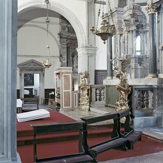
I had about forty-five minutes inside the church of Santa Maria Formosa before the light went. I shot eight frames (I think), of which this is the best – though that's not saying much. What was I looking at? I remember noting the following (in no particular order):

1) The light in the window on the right shining through the columns of the altar.

2) The red of the carpet, the green on the front of the altar and the mottled, pinkish organ booth. If a space is not articulated by contrasts in the distribution of colour, then there’s no point in using colour film.

3) The two prominent hanging lamps, which represented a problem that I was unable to solve to my complete satisfaction (so that their current positions within the frame were a compromise).

4) The golden angels, and in particular the fact that one of them is being ‘stabbed’ in the head by a partially-visible statue on the altar behind.

5) The position of the column at the left in the foreground relative to the pediment of the doorway in the background.

6) The four objects covered in white cloths on the left side of the frame. (What exactly is the tilted object on the floor? I don’t know and it bothers me.)

7) The difference in the source and intensity (and hence the colour) of the light through the doorway on the left. I was less aware of the patch of cold light at the bottom right and I didn’t notice the colour shift in the column on the left at all. The latter effects are stronger on the film than they appeared to the naked eye.

8) The red thread running around the benches, which is a more delicate but more absolute boundary of the space within than the benches themselves. And it is somehow important that the thread is red. (N.B. The thread may not be visible in the miniatruzed version above.)

9) The figure in the painting through the door on the left. It was important to show all of it. (The figure is also difficult to see in the version here.)

The list could be extended – but never to the point where it includes everything in the frame.

Thursday, November 25, 2010

'Tree of Codes' by Jonathan Safran Foer


Tree of Codes
is Jonathan Safran Foer's new book, which is a 'treated' edition of The Street of Crocodiles by Bruno Schulz, in the spirit of Tom Phillips' A Humument. It is published by Visual Editions. There's a good interview with Safran Foer in the NYT (extract below).

Q.Where did this strong affinity for graphic design come from?

A.Where would the lack of interest in design come from? Why wouldn’t — how couldn’t — an author care about how his or her books look? I’ve never met an artist who wasn’t interested in the visual arts, yet we’ve drawn a deep line in the sand around what we consider the novel to be, and what we’re supposed to care about. So we’re in the strange position of having much to say about what hangs on gallery walls and little about what hangs on the pages of our books. Literature doesn’t need a visual component — my favorite books are all black words on white pages — but it would be well served to lower the drawbridge
.

Monday, November 22, 2010

Podcast on the Design of Five Wounds

The podcast of my talk on the design of Five Wounds, originally delivered to the Centre for the Book at Monash University on 20 Oct., is now available to download if anyone wants to listen to it at home. Alternatively, I have also uploaded and embedded the audio below.


The original talk was of course accompanied by illustrations. I have posted the most important of these below. The numerical headings are time cues, which refer to the point in the audio file at which I discuss the image in question. Anyone who wants to get a sense of what the book looks like before listening to the talk can check out these short videos, in which I flip through a copy and explain the various elements.

4:55: Freud Caricature

Freud Caraicature: What's On a Man's Mind


6:40 : Synaesthetic Paradise Diptych [I can't get this double image to work in the audio, and I waste a couple of minutes fiddling about with it]:

Synaesthetic Paradise (left panel)

Synaesthetic Paradise (right panel)


10:55: Plate 6: Cuckoo's reflection.

Plate 6: Cuckoo's reflection


12:00: Alternative Representation of Cuckoo's Face

Annotation


13:50: Gabriella's Shield

Gabriella's Coat-of-Arms


13:57: Magpie's Shield

Magpie's Coat-of-Arms


15:00: Heraldry Sketches

Heraldry Sketches for Five Wounds 1


15:15: Heraldry Grid

Grid of Index Shields for Five Wounds (draft)


15:40: Sample Page Layout [see also 18:30 for discussion of the illustration included within this sample page]

Five Wounds Sample Layout (right)


17:00: Running Head [N.B. The pages above and below are two sides of the same layout, and thus the running head below serves as a title card for the illustration on the page above.]

Five Wounds Sample Layout (left)


24:55: Geneva Bible Page Layout (1560)

1560 Geneva Bible


25:00: King James Bible Page Layout (1611)

1611 King James Bible


25:30: Modern Bible Page Layout

Modern Red Letter Bible


40:00: Plate 15: Cut me

Plate 15: Cut me

[All illustrations except the Freud caricature, the heraldry sketches and the page layouts are by Dan Hallett.]

Wednesday, November 17, 2010

Sydney Freecon, 19-21 November 2010

This weekend I shall be participating in the Sydney Freecon, organised by Garry Dalrymple of the Sydney Futurians. There will be several events featuring local science-fiction / fantasy / horror writers, all taking place in Bankstown public library or nearby. As the name implies, there is no charge for attendance.

I shall be there on Friday evening (when I shall be giving a short reading) and Saturday afternoon (when I might possibly be available for a 'kaffeeklatsch' open discussion with other attendees, depending on interest).

The current draft programme is here.

Thursday, November 11, 2010

Passion

[Originally posted on the Melbourne Writer's Festival blog:]


There’s a scene from Robert Bresson’s film Pickpocket, which the screenwriter and director Paul Schrader quotes repeatedly in his work – but Schrader alters it.

The version in American Gigolo takes place in an official area. A woman visits a man. They’re separated by a pane of glass. The woman brings her right hand up across the line of her body, reaching forwards, and rests the outer edge of her fingers along the inside of the glass. The man leans in to press his forehead against the same point on the other side of the glass, hard. Their movements are reciprocal rather than identical. It’s the closest they’ll ever get to touching.

In Pickpocket, Bresson’s protagonists are also separated, but by bars rather than glass. They can touch, if only obliquely. She kisses his fist, which grips a bar. He presses his cheek to her temple; or rather they press together the small cross-sections of skin that can be contained within a single square of the prison grid.

In the version of the scene from Schrader’s Light Sleeper, there are no bars and no glass, and the final shot initially appears to be a still, which freezes the image of Willem Dafoe’s character kissing the hand of Susan Sarandon’s character. But even as the credits roll, even as they keep rolling, it’s only the flickering of Dafoe’s closed eyes – moving like those of a dreamer in the R.E.M. phase – that betrays the patience of both actors.

Monday, November 8, 2010

Transcendent Blankness

[Originally posted on the Melbourne Writer's Festival blog:]


The film Morvern Callar by Lynne Ramsay is based on a book by Alan Warner (although the source novel has a completely different tone to the adaptation). The title character is a young woman whose boyfriend has committed suicide as the film opens, leaving behind the manuscript of a novel, which Morvern then submits to publishers under her own name, successfully, as it eventually turns out.

The clip above is the final scene. It may not be apparent that Morvern is actually wearing earphones connected to a Walkman (this is pre-iPod), which provides an implied diegetic source for the soundtrack, even if the version we hear is obviously overdubbed. This theory is subsequently confirmed by the final few seconds of the clip, in which the sound is ‘overheard’ through earphones turned up too loud, although by that point there is no accompanying image, so that the sound only becomes literally diegetic after it has ceased to make sense in diegetic terms.

Clearly there is something else at stake besides narrative logic by the time we get to the black screen.

I remember going to a concert with friends when I was a teenager, when one of our group also insisted on wearing a Walkman, through which he listened to heavy metal, to register his disgust at the sappy Christian folk being performed on stage. This has always struck me as a peculiarly eloquent and perverse gesture, which expresses both the need to belong to a group and the inability to reconcile oneself to that need. I think that this same gesture, whose perversity goes unremarked in the clip, except insofar as its eloquence is amplified by the sound design, means something more in Morvern Callar, as the title of this post implies.

The sequence also works visually of course. It is not merely moving bodies filmed under a strobe. Rather, it is a tour-de-force of choreography and editing, in which a series of jump cuts disguise abrupt focal shifts as well as changes in the lighting.

'Transcendent blankness' is actually a pretty good description of the effect obtained in the films of Robert Bresson, who is one of Lynne Ramsay's influences (and on whom, more anon).

DEDICATED TO THE ONE I LOVE.

Friday, November 5, 2010

Five Wounds: Review at 'Transnational Literature'

The latest issue of the academic e-journal Transnational Literature includes a review of Five Wounds, written by Aliese Millington. An extract is below: Think back to your first trip with Alice tumbling down the rabbit hole, or how it felt to enter the Matrix after Neo takes the red pill. Five Wounds: An Illuminated Novel takes you down a similarly twisting path and leaves you pondering the journey well afterwards. Pooling influences trans-national, trans-cultural, trans-temporal and transart form, authors Jonathan Walker and Dan Hallett spin the story of ‘five wounded orphans [who] must face their traumatic origins’ (blurb). These tales are told through the fascinating combination of Walker’s proclamatory prose, Hallett’s Goya and comic-book influenced illustrations, a Bible-like layout and handwritten notations. Described as ‘cruel and arbitrary’ (blurb) by the authors, the world of Five Wounds looks and feels at once early renaissance, modern and apocalyptic. I am particularly pleased to see a review in a journal on transnational literature, since many of the sources for Five Wounds are Italian: notably, Italo Calvino and Tintoretto. Below is a selection of transnational sources taken from a detail of an illustration (by Dan Hallett) on p. 100 of the novel.

Transnational Literature

Monday, November 1, 2010

Mornings

[Originally posted on the Melbourne Writer's Festival blog:]

At this hour of the morning,’ he said, addressing nobody in particular, ‘people who are awake fall into two categories: the still and the already.

So says a character in Italo Calvino’s story ‘The adventure of a wife’ to the protagonist, who has wandered into a cafe at six a.m. She, like the speaker, falls into the first category, since she is on her way home after being out all night.

In 1994, I was up at six a.m. almost every morning, but for the first part of the year I was a ‘still’ and in the second part I was an ‘already’. In the 'still' part of the year, I worked on the night shift as a security guard at a cardboard factory. (I think that’s what they made. I didn’t really care, so I never bothered to find out). In the 'already' part of the year, I worked as a postman, and I started work at 5.45. In both jobs I set a record of sorts: I had the longest hair of any security guard in Glasgow that year; and later I was the slowest postman in the entire city.

I became a connoisseur of tiredness during this period. The first critical distinction to be made on that subject is related to Calvino’s observation, since the tiredness of staying up too late is qualitatively different from the tiredness of getting up too early.