height

Friday, October 20, 2023

Five Wounds: Dogs

Chantal Montellier, Like a Dog


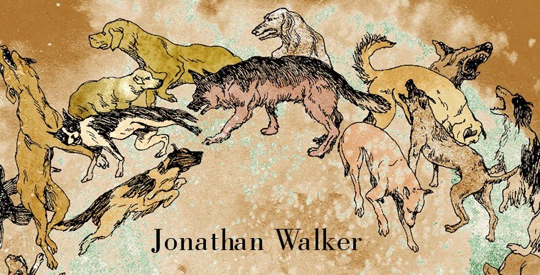
Dogs occupy a prominent and sinister role in Five Wounds, partly because of events in the autobiographical backstory to the novel. But there are other reasons for this canine presence. Dogs are ubiquitous in modern Venice, which is actually quite baffling given the lack of parks in the city. Hence Venetian streets are notoriously littered with dog shit, which no-one ever bothers to clean up. Considering this, I imagined a variation on Kipling's animal tales ('How the cat got his tail', 'How the camel got his hump', etc.), in which a child might ask her father, 'Why are there so many dogs in Venice, daddy, and why are they so spoilt?', and the answer might be, 'Well, daughter, once upon a time, the dogs ruled this city, and they still have their ancestral privileges, although they have no real power any more'.

Below I review a menagerie of fictional and literary dogs, many of whom were barking away down in my subconscious as I wrote. I am just listing the ones that come immediately to mind now as I write. I didn't ever make a comprehensive list, and I omit here several relevant examples already mentioned in Dan's post about the Black Dog.

The most explicit historical reference to dogs in Five Wounds is to a passage from the Hierogylphics of Horapollo, which is quoted by Crow in the chapter 'A Meeting of Minds', as follows (I may have tweaked the text slightly to fit the context; I don't have the original in front of me):

When the Egyptians wish to indicate a scribe, or a prophet, or an embalmer, or the spleen, or a judge, they draw the hieroglyph of a dog. A scribe, since he who wishes to become an accomplished scribe must bark continually and be fierce and show favours to none, just like dogs. And a prophet, because the dog looks intently beyond all other beasts upon the images of the gods, like a prophet. And an embalmer, because he looks upon the bodies which he has taken care of naked and dissected. And the spleen, since the dog alone among other animals has a very light spleen. If death of madness overcomes him, it happens because of his spleen. And a judge, because as the dog gazes intently upon the images of the gods, so the judge of ancient times contemplated the king in his nakedness.

Horapollo's treatise is a neo-Platonic interpretion of Egyptian hieroglyphs from the early Christian era. It was very influential in the Renaissance, but it is based upon almost entirely erroneous premises, a fact that was not proved conclusively until the discovery of the Rosetta Stone in the nineteenth century. Horapollo therefore fits the theme of interpretation / misinterpretation that runs through Five Wounds, which is why I was reading the treatise in the first place, but then I came across the passage on dogs, which could be made to fit my five protagonists.

Other dog references are less openly acknowledged, like the famous last line from Kafka's The Trial, 'Like a dog', which is quoted above in a comic-strip version of the novel, adapted by David Mairowitz and Chantal Montellier. The phrase is Joseph K.'s final reflection upon himself, and upon his treatment at the hands of the law, as the executioner's knife descends. Here the dog is a figure of the abject, of the pariah, who is excluded from human society, like the outlaw of medieval legend, whose figure is the wolf.

Several dogs in Dante's Inferno are rendered below in William Blake's illustrations. The first image is of the three-headed Cerberus, the guardian of the underworld from classical mythology (Dante's text, like Five Wounds, jumbles its mythological and historical frames of reference). In the Inferno, Cerberus torments the souls of the gluttonous, whose fate is elucidated in Dorothy L. Sayers' commentary, as follows (p. 107):

The Gluttonous: The surrender to sin which began with mutual indulgence leads by an imperceptible degradation to solitary self-indulgence. Of this kind of sin, the Gluttons are chosen as the image. Here is no reciprocity and no communication; each soul grovels alone in the mud, without heeding his neighbours - "a sightless company", Dante calls them. .... [Cerberus] is the image of uncontrolled appetite; the Glutton, whose appetite preyed upon people and things, is seen to be, in fact, the helpless prey on which that appetite gluts itself.

William Blake, Second version of Cerberus

Later in the Inferno, Dante and Virgil travel through the Wood of the Suicides, in which the souls of the inhabitants are imprisoned in sterile trees. The trees cannot speak, unless their branches are broken, whereupon they bleed, and they can whistle through the coagulating blood, until it clots, when they are once again condemned to silence. Also trapped in the Wood of the Suicides are the Profligates, who run through it, pursued eternally by black dogs (aha!), and in fleeing, they tear the branches from the bleeding trees as they pass.

William Blake, The Hell-Hounds Hunting the Destroyers of Their Own Goods

In the Inferno, dogs are therefore associated with the gluttonous and the profligate, and the latter group is also associated with suicide: All these ideas can also be linked to the theme of addiction.

At the beginning of the Inferno, dogs are also associated with avarice via the figure of one of the three beasts that terrify Dante in canto 1 (see illustration below): the She-Wolf, who can only be vanquished by the prophesied Greyhound, the Master-hound. Here is Sayers again on this image (p. 75):

The Beasts [Leopard, Lion and She-Wolf]: These are the images of sin. They may be identified with Lust, Pride, and Avarice respectively, or with the sins of Youth, Manhood, and Age; but they are perhaps best thought of as the images of the three types of sin .... The Greyhound has been much argued about. I think it has both an historical and a spiritual significance. Historically, it is perhaps the [p. 76] image of some hoped-for political saviour who should establish the just World-Empire. Spiritually, the Greyhound, which has the attributes of God (“wisdom, love, and power”), is probably the image of the reign of the Holy Ghost on earth – the visible Kingdom of God for which we pray in the Lord’s Prayer.

William Blake, Dante Running from the Three Beasts

The following passage from Walter Benjamin's The Origin of German Tragic Drama, p. 152, refers to Albrecht Durer's engraving of Melancholy (which features a sleeping - no doubt dreaming - dog), and which 'portrays the dangers of excessive study', a highly relevant theme for Gabriella and Crow:

One of the properties assembled around Durer's figure of Melancholy is the dog. The similarity between the condition of the melancholic, ... and the state of rabies, is not accidental. According to ancient tradition 'the spleen is dominant in the organism of the dog'. This he has in common with the melancholic. If the spleen, an organ believed to be particularly delicate, should deteriorate, then the dog is said to lose its vitality and become rabid. In this respect it symbolizes the darker aspect of the melancholy complexion. On the other hand the shrewdness and tenacity of the animal were borne in mind, so as to permit its use as the image of the tireless investigator and thinker. 'In his commentary on this hieroglyph Piero Valeriano says explicitly that the dog which "faciem melancholicam prae se ferat" [bears a melancholy face] would be the best at tracking and running'. In Durer's engraving [of Melancholy], especially, the ambivalence of this is enriched by the fact that the animal is depicted asleep: bad dreams come from the spleen, but prophetic dreams are also the prerogative of the melancholic.

Albrecht Durer, Melancholy


Coincidentally, Dan also discusses Durer's Melancholy in relation to another illustration for Five Wounds, although it was not a reference that either of us ever mentioned to each other.

Another source I came across in the British Library in 2006, while I was researching Goya, is an English translation by Abraham Fleming of a Latin treatise by Johannes Caius, On English Dogs, first published in 1576. The following passage is from p. 17:

Of the dog, called the Thievish dog; in Latin, Canis furax.

The like to that whom we have rehearsed, is the Thievish Dog, which at the mandate and bidding of his master fleereth and leereth in the night: hunting conies by the air, which is leavened with their savour; and conveyed to the sense of smelling by the means of the wind blowing towards him. During all which space of his hunting he will not bark, lest he should be prejudicial to his own advantage. And thus watching and snatching in course as many conies as his master will suffer him; and beareth them to his master’s standing. The farmers of the country, and uplandish dwellers, call this kind of dog a Night Cur; because he hunteth in the dark.


I took one of the running heads in Five Wounds from this passage: 'Leavened With Their Savour'. Interpreted in the context of the novel, this passage might also be a way of linking the character of Cur, the dog-man, to that of Magpie, the nocturnal thief.

Finally, the barking of dogs represents the idea of non-sense or 'noise' (as opposed to 'signal' in information theory), as in the following passage from A. S. Byatt's Babel Tower, in which an expert witness testifies in court during an obscenity trial that serves as the novel's climax. The book on trial here is Babbletower, an allegory written by one of the characters within Byatt's novel, excerpts of which interrupt the frame narrative, along with several other competing, interpolated texts:

Well, let us start with the title. La Tour Bruyarde translates as the noisy, or shouting, or howling tower – the word ‘bruyard’ suggests the noise made by hound dogs. It is an image of the Tower of Babel which was constructed to displace God from Heaven, and was punished for its presumption by having a spirit of discord sent amongst its members, so that their languages were confused, they could no longer understand each other.

Five Wounds: Daguerreotypes

Susan Sontag's On Photography is a classic introduction to the medium, whose influence can be felt in almost all subsequent discussions. But there is a problem with it, in that actual photographers do not recognize its depiction of their activities, or perhaps more significantly, do not identify with its description of their motivations. Consider the following passage:

What is being urged is an aggressive relation to all subjects. Armed with their machines, photographers are to make an assault on reality – which is perceived as recalcitrant, as only deceptively available, as unreal. ‘The pictures have a reality for me that the people don’t’, Avedon has declared. ‘It is through the photographs that I know them’. To claim that photography must be realistic is not incompatible with opening up an even wider gap between image and reality, in which the mysteriously acquired knowledge (and the enhancement of reality) supplied by photographs presumes a prior alienation from or devaluation of reality. [On Photography, p. 121]

The idea that photography is at war with reality seems counter-intuitive to most of its practitioners, who also take exception to the idea that they are all, by definition, alienated voyeurs. An alternative point of view is advanced eloquently by Nan Goldin:

The instant of photographing, instead of creating distance, is a moment of clarity and emotional connection for me. There is a popular notion that the photographer is by nature a voyeur, the last one invited to the party. But I’m not crashing; this is my party. This is my family, my history. [The Ballad of Sexual Dependency, p. 6]

In a later interview, Goldin explains, again in implicit counterpoint to Sontag, 'For me it is not a detachment to take a picture. It’s a way of touching somebody – it’s a caress' [Nan Goldin: I'll Be Your Mirror, 1996, p. 452].

One of the protagonists of Five Wounds is the thief Magpie, who also works as a daguerreotypist. Daguerreotypes were created by a photographic process that yielded a unique, positive image. They were popular in the 1840s, but were subsequently rendered obsolete by William Fox Talbot's introduction of negatives, which permitted multiple prints to be made of any individual image. In the world of Five Wounds, however, the daguerreotype remains central. I chose it over other better-known photographic processes as a way of returning to the pre-history of an overfamiliar technology: to draw attention to unchallenged and unacknowledged presuppositions surrounding its later, more familiar variants, whose characteristics we retroactively assume to be given or inevitable. Other examples of this same technique in Five Wounds include the use of heraldry to think about superhero costumes and the introduction of a character with a mutant strain of rabies to think about werewolves.

Magpie's activities as a daguerreotypist are therefore a parody of the argument of Sontag's book. I started with a thought experiment: What if you were a Martian who had never taken or seen a photograph, and the only evidence you had as to what that activity might involve was Sontag's book? What kind of person would you imagine the ideal photographer to be? The answer is: a freak; an alienated thief. In the extract below, Magpie describes his philosophy.

1 AT first, Magpie had paid prostitutes to pose in his studio. They required no explanations, but in other respects they were not ideal subjects, because they had mistaken assumptions about the nature of his interest. He did not want the illusion of intimacy. 
2 To remind himself of this, he removed the faces from their portraits. It required little force. A single motion of his thumbnail would do it. 
3 ‘Don’t squirm. You’ll only get scratched.’ 

1 UNDER a magnifying glass, which revealed detailsinvisible to the naked eye, the image was fully present. More present than the living bodies of the prostitutes had ever been. 
2 ‘Pretend you’re dead if you like. That sometimes helps people stay still.’ 

1 MAGPIE would eliminate what was inessential and reveal what others could not bear to see. 
2 He would steal from his subjects the revelation of their deeper selves and the truest aspect of the world they inhabited. 
3 He would photograph the shift between the face people presented to others and the scratched face they revealed involuntarily and refused to acknowledge. 

In fleshing out this account, I did, however, draw on the work of several actual photographers to create the character of Magpie, as indicated below.


Magpie's Photographic Influences
Above: Magpie's Photographic Influences

Of these acknowledged influences, Witkin and Arbus are both famed for their interest in freaks, and in Witkin's case, for his habit of photographing corpses. Both photographers are paraphrased or alluded to within the novel (e.g. the extract above includes a paraphrase of a remark by Arbus); and, indeed, one of the epigraphs used at the beginning of Five Wounds is a quotation from Arbus. Bellocq photographed sex workers in early twentieth-century New Orleans, and several of his images, infamously, have the faces of the subject scratched out (below: Plate 29 from Storyville Portraits by Bellocq).


4 Bellocq Plate 29

This defacement has prompted much lurid psychosexual speculation in a manner derivative of Sontag's analysis: for example in Michael Ondaatje's novel Coming Through Slaughter (which features Bellocq as a character). There are in fact much more innocuous reasons why someone - not necessarily Bellocq - may have defaced the images. The obvious explanation is that it was at the request of the sitters, to preserve their anonymity. However, as in my (ab)use of Sontag's book, I picked up on this motif - of scratched-out faces - and gave it a more sinister origin related to Magpie's psycholgy; but I also asked Dan to use it for quite different purposes in the illustrations depicting one of the other characters in the novel: Cuckoo, the man with a wax face. He is always represented with a scratched-out face, in homage to Magpie, and hence to Bellocq (below: a plate from Five Wounds, Cuckoo's reflection).

Plate 6: Cuckoo's reflection

[Pie chart diagram and Cuckoo portrait created by Dan Hallett.]

Five Wounds: Photographs and Etchings

[The discussion below continues from two previous posts: one on 'Tone and Line', and one on 'The Making of Five Wounds' ]

Because of my experience as a photographer, when I came to write instructions for Dan for the illustrations for Five Wounds, I had a default aesthetic in which maximum definition of detail, low contrast, and a long tonal scale were important values. This photographic aesthetic led me to misinterpret certain aspects of Francisco Goya’s etchings, which Dan and I used as a common point of reference in the early stages of our collaboration (a couple of examples from Goya's series Los Caprichos are reproduced below).

Francisco Goya, Los Caprichos, Plate 21

Francisco Goya, Los Caprichos, Plate 64

Etchings are a reproduction technique based upon drawing, but Goya’s also use acquatint, which deliberately introduces random ‘noise’ into their backgrounds. Areas that might, in a different kind of image, be represented as an undifferentiated, empty field, or as cross-hatched, murky shadows, are instead broken up by the application of acquatint, which creates an irregular textured effect, as in the examples above. I did not actually know what acquatint was when Dan and I began to work on Five Wounds, but I could nonetheless see that Goya had flattened the tonal scale by breaking up the backgrounds of his images with the visual equivalent of static. The only analogy I could think of was film grain in photography.

It did not help that the editions of Goya I consulted were printed at a lower contrast than the original etchings (this is not the case with the samples above, which are more accurate reproductions). Reproductions of etchings in modern books usually involve their conversion into half-tones via photographs of the originals. Getting thick blacks in a printed book requires heavy paper to hold the requisite amount of ink, and multiple passes through the press to build up the densities (in some cases, it may also involve the addition of other colours into the black areas, to create a so-called 'rich black'). Conversely, the white end of the tonal scale is represented by whatever the paper base is, and in cheap editions this is invariably a dirty grey rather than a bleached pristine tone. Cheaper, mass-produced images therefore almost always sacrifice accurate representation of tonal values for budgetary reasons, but I did not realise this, and so I thought that the flat contrast was an effect intended by Goya.

The first set of images that Dan created for Five Wounds were the ‘Plates’, and my scripts for these were heavily influenced by my misinterpretation of Goya, as mediated through my experience as a photographer. I therefore asked for an oppressive, clinical accumulation of detail, almost like a Pre-Raphaelite painting, except with the opposite emotional effect, and I wanted a flattened tonal scale that corresponded to a flattened emotional response: that is, to the experience of trauma, which results in an inability to organise memories effectively (that is, an inability to suppress irrelevant information, to forget).

I also conceptualised the desired compositions in photographic terms. So I often asked Dan for either ‘telephoto’ or ‘wide-angle’ effects. The former implies a flattened perspective, a compressed representation of space that makes it difficult to separate near from far; the latter, by contrast, implies that space is opened up via abrupt recessions and violent changes in scale between the foreground and background. Wide-angle compositions are inherently melodramatic; telephoto compositions create a feeling of constraint. Mostly, I wanted telephoto effects. But the most explicit manifestation of this collision between two different aesthetics was that I asked Dan to incorporate pseudo-photographic textures into his drawings.

Many of these textures are used to suggest that the physical integrity of the image itself is breaking down, but in a radical sense: that is, in these images, the medium of drawing itself cannot maintain its integrity as a specific technology of representation, and it is therefore 'contaminated' by photography. Hence my scripts for Dan jumbled up picture references from works on the conservation of etchings, and those on daguerreotypes (an early photographic technology that is referenced extensively within the text of the novel), but – somewhat perversely – in both cases I only copied those images that illustrated what happened when things went wrong.

Several of the Plates therefore have pseudo-acquatint effects as well as pseudo-photographic textures, and they have a long, soft tonal scale, with minute accumulations of detail. Ideally, I wanted the viewer to be able to go over them with a magnifying glass.

Plate 14: Dust, dynamic

For example, I'll Huff and I'll Puff ..., above, includes acquatint effects in the background, which are here given a kind of diegetic justification within the picture space by analogy to the event depicted in the foreground, which shows Crow blowing a handful of dust towards the recumbent Magpie. In the novel, the dust represents the relationship between signal and noise in information theory (among other things). In fact, there are two 'clouds' of dust in the image here, representing the exhalations of the two characters shown, one cloud contained within the other, and both contained within the surrounding aura of the textured background. In other words, there is no clear conceptual separation between object and field, an idea I took from photography, and from Goya's use of acquatint.

The figure of Crow on one knee from Plate 14 is cloned and placed at the centre of the subsequent ... And I'll Blow Your House Down, reproduced below, which depicts the destruction of the ducal palace in Venice by means of an explosion, in a development inspired by Guy Fawkes. The use of concentric circles in the composition is a reference to Tintoretto's Paradise (which is also alluded to in several other illustrations). The reproduction of Crow's draws a visual analogy between the exhalation of breath in the earlier images and the violent, massive displacement of air in the explosion here, an analogy underlined by the image titles.

Plate 16: Bang!

The level of detail and the minute variations in textural effect that Dan worked into the Plates is probably not apparent in these online reproductions, but it may be observed from a magnified detail, appended below.

Detail from Plate 16: Bang!

As might be expected, the photographic aesthetic I had in mind sometimes 'clashed' with Dan's instincts as an artist. As a result, he sometimes ignored (or perhaps creatively misinterpreted) my instructions. Dan seemed to prefer chiaroscuro effects and what I would describe as wide-angle compositions, but in editing these images, I would often ask him to break up areas of undifferentiated tone with noise, or to add additional layers to an image, to build up a sense of compression.

The final version of Cur’s first murder, followed by the draft, reproduced below, indicate this conflict – or rather ongoing dialogue – clearly. Note that, in this image, as in several others, the ‘effects’ (the textures that mimic picture damage) are both ‘inside’ and ‘on top of’ the image: they exist in both the picture space and on the picture plane, and, as I suggested above, one of their purposes is in fact to obscure this conceptual distinction, as the accompanying text obscures the distinction between realist narrative and allegory. The 'effects' therefore apply most visibly to areas of the image that would otherwise be rendered as either pure white or pure black.

Plate 2: Cur's first murder

Corrections to Plate 2

When we moved on to the later stages of the collaboration, and in particular to an entirely separate set of illustrations, which are integrated into the page layouts, Dan switched techniques. In contrast to the plates, these later images embrace the limitations of drawing, and revert to its binary system of black line against a white field. This was a logical extension of my intention to give Dan greater creative autonomy in this phase of the collaboration: that is, he was no longer under any obligation to mimic photographic effects, or to conform to my aesthetic expectations. Below are a couple of these 'pure' drawings, which have a quite different feel to the Plates, emotionally as well as technically.

Cur and the black dog

Cuckoo the trickster

Tone and Line in Photography and Drawing

Drawing is a binary system. In its purest form, it includes only black line and empty white space: one and zero. Forms are distinguished by tracing their edges as lines, and intermediate tones can only be simulated by a crude kind of optical illusion: that is, by cross-hatching. Line defines form.

Conversely, in a monochrome photograph, there is no absolute distinction between object and field, and there are no lines as such. A black-and-white photograph is a map of variations in tone along a single, continuous scale, which runs from pure white to pure black. This scale may be long or short, depending on contrast: that is, a high contrast image has a short tonal scale, with relatively few intermediate tones between white and black, so that the transitions from one tone to another are more visible and abrupt, whereas a low contrast image has a long tonal scale, with much smoother transitions. Another way of putting this is that, in a photograph, edge definition (known as acutance) is a function of contrast. Contrast defines form.

It therefore follows that, in a photograph, formlessness is a consequence of lack of contrast: that is, of lack of differentiation in the distribution of light. If the overall light levels are so low as to be beneath the threshold of the film or sensor, then it will process the scene as empty, and the resulting image will be pure black. Similarly, if the overall light levels are so intense as to render internal differences in reflective density between surfaces as irrelevant, then the resulting image will be pure white.

These principles also affect the distribution of light and tone within a normal image. Any given photograph will probably have some areas of ‘empty shadow’ where the light is not strong enough to cause the film to respond at all; conversely, it will also have areas of ‘blocked highlights’ in areas where the light is so intense as to overwhelm the film’s ability to discriminate between different reflective densities. The trick to exposing the image correctly is to get the balance right. In most images, this means placing the principal subject of the image at the mid-point between these two extremes. Conventionally, this mid-point is a grey tone with 18% saturation.

According to the philosophy of Ansel Adams, from whose instruction manuals I learnt how to photograph, a good print is one that exploits the entire tonal scale. For Adams, one of the great virtues of photography is its power of precise description, and the problem with high-contrast images is that they suppress detail. Adams believed that it is necessary to have small areas of pure black and pure white in a print to properly calibrate the tonal scale, but that these areas should not occupy a large part of the image’s total area, because whenever they do so, this results in loss of information. Large blank areas in a photograph are just wasted space: damning evidence that a photographer does not know how to fill them. In this approach, then, chiaroscuro effects, that is, deliberate restriction of the tonal scale in high-contrast images, are a kind of cheap melodrama, and an admission of failure on the part of a photographer who cannot find any other means to make an image eloquent. Judged on these criteria, the entire output of an artist like Bill Henson would be found wanting.

Adams did of course admit the possibility that some images might use such negative space effectively, and indeed his later prints tend more and more towards chiaroscuro, but the presumed norm for him was always maximum descriptive information, and the longest possible tonal scale. Individual scenes or prints might deviate from this norm according to the nature of the scene and the desired effect, but a photographer should have the entire tonal range available to her, even if she chooses not to use the entire range in a particular image.

When I began to photograph in Venice at night for the project that eventually became Push Process, I had Adams’ advice in mind. Initially, therefore, I tried to avoid large areas of empty black or white even in scenes that were inherently high-contrast. In part, this was to avoid fetishising the fact that I was working at night. Nonetheless, the resulting images are generally ‘low-key’ (that is, dark tones predominate, with selected areas of very bright tones around light sources). Distribution of light in a scene is inevitably quite different at night than it is during the day. It is, of course, much lower in intensity overall, but it also tends to be more constant (and therefore predictable) at night, whereas it may change drastically during the day according to the sun’s movements and the weather. What I wanted to do was to take advantage of the different appearance of scenes at night to defamiliarise them, without succumbing to the temptation to use those differences to romanticise the subjects. In some cases, particularly when there is no visible light source, there is something obviously odd about the lighting, but the night setting is not immediately apparent as such. Later on, I did resort to more chiaroscuro effects, when I was shooting hand-held and fighting against the limitations of the camera and film, but that was a deliberately artificial formal experiment: What can you achieve at the absolute limits of the equipment’s ability to function?

[Discussion continues in this post:]

Five Wounds: The Making of

Following on from the previous post, this one has more detail on the collaborative process involved in the creation of Five Wounds.

Dan and I met in Cambridge in 2001. I was a postdoctoral researcher at Cambridge University. Dan was studying for a degree in illustration, and was working in a comic shop, where he took my order for a copy of Alan Moore’s The League of Extraordinary Gentlemen. Here are some other salient facts: 

1) Our collaboration works entirely by e-mail correspondence. Since 2002, we have only been in the same place once: in London in 2006, when we spent most of the afternoon walking around trying to find a screening of Mirrormask by Dave McKean and Neil Gaiman. We failed. 

2) Dan is probably the only person capable of interpreting my weird scripts. Scientific research has proven that they cause migraines and disorientation in other illustrators. 

3) Dan created the illustrations for my first book, Pistols! Treason! Murder!, which is about a real-life Venetian spy, who was executed for perjury in 1622. These illustrations are all in the style of seventeenth-century allegorical woodcuts. 

4) As a child, my bedroom was full of half-assembled model aeroplanes; Dan’s was full of insects in jars. This seems somehow significant. 

Dan and I began with a shared interest in comics, which offered a set of guidelines for how it might be possible to work together. Mainstream comics companies operate by means of a highly specialised division of labour, not only between writer and artist, but between writer, penciller, inker, colourist and letterer, et al – a system that was probably inspired by the factory assembly lines of Henry Ford rather than by any sense of its creative potential. The goal was to maximise efficiency for an industry in which the turnover of product was very rapid (weekly or monthly), and insofar as there was a coherent creative vision involved, it was arguably that of the editor, whose role in the process was analogous to that of a Hollywood producer. 

Even so, one may adopt analogous, if rather less rigid, divisions of labour for reasons other than industrial efficiency: for example, a conviction that collaboration, if entered into in the right spirit, will inevitably increase a work’s range and power. It was important that Dan was trained as an illustrator – that is, in a discipline that accepts collaboration as a sine qua non of its existence – because the goal for any collaborator should not be to protect the integrity of their individual contribution; rather, it should be to serve the story and the book as a whole. 

For me, faced with the task of writing a script for Dan to work from, the central question was, how do you describe a picture that doesn’t exist yet? And how do you relate that description meaningfully to other descriptions of other pictures that also don’t exist yet? The ancient rhetorical convention of ekphrasis suggests some historical answers to this question, but more recent practical help was available via several examples of published scripts for comics

The earliest set of illustrations created for Five Wounds were the plates, which are included in the printed book as separate pages at the end of several chapters. I wrote hundreds of words of instructions to Dan for each of these. Below, for example, is the script for what is now the first of these plates, Initiation, and which concerns a character called Cur. Dan had of course already read the novel when he received this script, but for blog readers, some additional contextual information might be helpful. 

In Initiation, then, Cur has been kidnapped by dogs, and is being introduced to their group in a quasi-magical ritual. Also of relevance is an earlier incident, in which chickens were killed by the dogs as one of them bit three fingers from the hand of Cur’s father. In my script, both the chickens and the fingers are transposed to the later scene, and the fingers also ‘stand for’ three of the other protagonists of the book, who are identifiable by coded references to heraldic colours superimposed on the different fingers.

Hence this script instructs Dan to synthesise a number of scenes from the written narrative, and also to make certain ideas explicit visually that remain implicit in the text.  

SCRIPT FOR INITIATION 

A straight down overhead shot and a ‘non-literal’ pic. A wailing, crying baby Cur is lying on his back at its centre (relatively small within the frame). Underneath him are the internal lines of a pentangle in white. It will be clear from another illustration that each of the points around the pentagram stands for one of the book’s five protagonists. The sequence (running clockwise and starting from the upper left) begins with Gabriella, then Cur (the subject of this image, whose nominal assigned place is at the apex of the pentagram), then Cuckoo, Magpie and Crow. 

The left arm of baby Cur is reaching out, grasping in the direction of Cuckoo’s point on the pentagram. Around baby Cur, the pile of overlapping, slaughtered chickens will be laid in a circle along an implied outer circle, to convert the pentagram into a pentacle. Outside this circle are three severed fingers (the middle, the third and the little respectively). You should over-size them dramatically; that is, put them at a different scale to that used for Cur and the chickens (this is not apparent on my sketch). You’ll probably also need to exaggerate the nails and possibly the joints to make it clear what they are – maybe use a blood stain where they end too. 

The fingers are to be cross-hatched in the appropriate heraldic tones: checks for black Cuckoo, towards whose finger Cur’s left hand seems to be grasping, while his right hand lies open and passive in the direction of where Gabriella’s shield would implicitly be; a blank white third finger for Magpie, and a dotted little finger for Crow. Cur’s feet appear to be kicking against the latter two as he wails and cries. 

The severed fingers should be curled over and placed casually in roughly the right place, but not geometrically aligned or pointing inwards toward the centre. 

Cur’s tears could be highlit as blank white trails to contrast with a full black trail of blood down his face that is placed at the central point in the shaving scene pic

Outside the first circle of chickens that occupies the position of the pentacle circle is a second, looser circle of intertwined dogs, of different breeds and in different postures. They don’t all have to be huge and grim and black, but no Yorkshire terriers or Chihuahuas please. Their coats should be shaded using different ‘pasted on’ corruption effects (one for each dog). 

These two circles (the inner chicken one and the doggy outer one) foreshadow the two circles of the exploding palace illustration (which in turn reference Tintoretto’s Paradise in the ducal palace). 

Reduce the outer circle to four partial arcs, one in each corner. The dogs in the circle are not seen realistically from overhead, but from varying partial viewpoints, whatever is most useful to get an intertwining effect. Lots of emphasis on teeth and tongues please. 

Fill any empty space with ‘effects’, which here should emphasize fluid, flowing, overlapping stains and discolourations: that is, they should resemble water damage, since Cur recalls this experience in later life by way of a dream of drowning.  

I also drew a crude storyboard sketch to accompany this script, which I reproduce below (click to enlarge).

Storyboard Sketch for Plate 1

Since putrefaction and decay are major themes in the book, many of the Plates are marked with signs of their own physical degradation. The term ‘effects’ in the script therefore refers to these signs, which, in this case, Dan created using coffee and tea spilled on paper. Can you predict what the finished image might look like on the basis of the script above and the sketch? This was Dan’s task: to first imagine that image, and then to create it. Below is the result.

Plate 1: Initiation  

Above: Plate 1, Initiation, from Five Wounds (click to enlarge)

Some images went through several drafts, not because of any deficiencies in Dan's execution, but because I struggled to think clearly about what the proper relationship between image and text should be, or in what way precisely the image should embody broader themes from the book. 

Below, for example, are the initial instructions for what eventually became Magpie in the forest, followed by successive revisions of the image itself, the latter interspersed with selections from my e-mails to Dan. 

 SCRIPT FOR MAGPIE IN THE FOREST 

A track through a forest (Goya trees and shadows around Magpie).). A bat above, foreshadowing the incident with the first daguerreotype. We are looking at Magpie from the side and in long shot. He is holding a mirror reflecting the moon, the same mirror that Cuckoo holds in Plate 6, Cuckoo’s reflection, but Magpie is much less dominant within the frame than Cuckoo is in Plate 6. 

Magpie is dwarfed within the skeletal, snowy landscape of trees, which are layered and compressed on different planes. He is almost lost or tangled up among the tree branches, which overlap in front of him and partially obscure him, but his head, cloak and mirror remain clearly visible, as do the sky, stars and moon in the upper third of the frame. He appears within a small break in the trees (see reference pix from Blankets and Black Hole for this effect). 

The moon should be absolutely realistic and as detailed as possible, but ‘solarized’ at its upper edge as the black sky bleeds off into ‘deteriorating daguerreotype’ effects. The moon in the mirror is miniaturized but clearly recognizable. The snow falling and in drifts between the bare tree outlines allows you to rhyme the dappled effect on Magpie’s face with black and white tonal variations in the landscape. 

Compare the Blankets pix for how to show snow, dark forest and highlit figures within. There are also various good dark forest shots in Black Hole (without snow). I attach a fantastic snow effect scene from Sin City, although note that a lot of Miller's effects rely on his omission of half-tones: i.e. everything is either pure black or pure white in each frame, which is a quite different technique to that I want for the Plates, where the tonal range is longer and flattens off towards the two extremes.  

Try and keep some the textural detail of the folds of the cloak, but have the cloak down instead of up.

Plate 10 - Version 1  

Plate 10: Version 1

E-mail dated 18 May 2006: We need a daguerreotype version of the moon, not a drawn one. For the 'solarized' effect, you may need to create a smoother texture than is possible with pen and ink, using cloning in Photoshop with a dull metallic dark grey. Anyway, see what you can do. Also, too chiaroscuro. Flatten out the midtones by adding a background layer of mid-tone grey in Photoshop.

Plate 10 - Version 2  

Plate 10: Version 2

E-mail dated 2 June 2006: Lose the bat and close up the cross-hatching where it currently is. Also, I think we need a bit more snow, especially in the central and lower areas, where it is more or less absent. You could have another go at getting an effect whereby the snow is both a distinct layer ‘on top of’ the picture space, but also continues inside the picture space and blends into a corrupt background, although I appreciate that this may not be possible. 

In addition, Magpie's left hand (the one not holding the mirror) needs greater definition of form. It is currently a bit amorphous and not very hand-like.  

E-mail dated 2 June 2006: It took me a while to register that your moon is rotated ninety degrees. The effect of this is actually rather interesting. It is completely 'wrong' from an astronomical point of view, since the moon is never lit from below but always runs through its phases along the vertical axis, and in your version its features are also all in the wrong place (for an astronomer, it will be like seeing the globe tilted ninety degrees on its axis). However, I think that perhaps it's a nice way of signalling on a subliminal level that there's something not quite right or logical about the world of FW. Everything is a bit skew-wiff - as the moon is - so in that sense it's 'right', and I'm inclined to leave it alone.

Plate 10 - Version 3  

Plate 10: Version 3

E-mail dated 8 June 2006 The grey layer is (as I read it) 'behind' the black outlines of the trees and the sky above. Add some grain / white specks, etc. to it – another different representation of snow – but this should not interfere with the black ink that makes up the tree shapes and shadow outlines or with the black sky and the moon above. 

If we divide the picture up into blocks and layers of tone and completely ignore the perspective and recession, it breaks down into: 

Foreground / top layer: drifting snow and moon 

Midground / middle layer: sky, black outlines of trees and their shadows below, Magpie in middle 

Background / bottom layer: layer of amorphous grey tone 'underneath' the drawn outlines (most clearly visible as such in the space immediately surrounding Magpie) - to which add white specks / grainy interference. 

Does this make sense? Hopefully it does. 

There were some further adjustments to the moon in the top left. The final image therefore looks like this.

Plate 10: Magpie in the forest  

Plate 10: Final Version

As a final twist in the production process, the written scene that originally inspired Magpie in the forest was actually removed from the manuscript during the structural edit. However, since I liked the image so much, I invented an entirely new scene, whose sole purpose was to provide a textual justification for the continued existence of this plate. Indeed, I frequently rewrote sections of the novel in response to Dan’s work, because the illustrations often clarified ideas that were insufficiently developed in the text, or brought things to my attention that had not occurred to me during writing. 

In retrospect, the level of detail in the scripts I wrote for the plates, as sampled above, seems excessive, although the obsession with control betrayed by this accumulation of detail had interesting aesthetic consequences. All the plates feel cramped and constrained, lacking in spontaneity (natural enough since many of them went through several drafts), but this feeling accurately reflects the world that they describe and the state of mind of the characters they depict. 

In later phases of our collaboration, however, when Dan and I had both gained confidence, my instructions were far less prescriptive. The feel of the later illustrations is therefore quite different from that of the plates, which helps to vary the tone and rhythm of the book’s visual elements. Some examples of these later scripts and illustrations can be found on Dan’s blog, where he discusses their creation from his own perspective: Jean in the Jar, The Black Dog, and The Bagatto

I look forward to seeing where our collaboration will take us next.

How do you edit an image?

During the production of Pistols! Treason! Murder! and Five Wounds, a curious discrepancy was apparent. The text was subject to minute editorial supervision. Every word choice and aspect of the storytelling had to be justified. By contrast, Dan and I received very few critical comments on the illustrations.

One possible explanation for this discrepancy is that Dan and I work the illustrations over thoroughly before anyone else sees them: that is, we edit them ourselves. Whereas I need an outside perspective on the text, which is supplied by the publisher, for the images Dan and I provide that perspective for each other.

In practice, therefore, editing an image might mean changing the composition so that so that it exemplifies broader themes that run through the book as a whole. In other cases, we adjust stray details so that nothing detracts from the overall effect: as below in the transition between the first draft of what is now Plate 2, Cur's first murder, in Five Wounds, and the amended, final version underneath.

Corrections to Plate 2

Plate 2: Cur's first murder

These two kinds of adjustment - to the underlying structure of the image and to particular details - correspond roughly to the structural edit and the copy edit of the manuscript. In other words, you edit an image according to much the same principles that apply when you edit text.

Five Wounds: Heraldry

In a previous post, I showed some of the sketches for the heraldic shields in Five Wounds. To create these shields, Dan and I had to learn the visual code of heraldry, which is governed by strict rules about how its various elements may be combined. These rules are analogous to a grammar. Indeed, heraldry is one of the few instances where this analogy really works when applied to a visual code. Heraldry is therefore a highly distinctive semiotic system, one might even say a uniquely pure semiotic system, and as such it represents one of the earliest historical examples of a coherent system of graphic design. 

According to the classic analysis of Ferdinand de Saussure, the signs that make up any given semiotic system can be broken down into two elements: the signifier (the actual sign, e.g. the word ‘dog’), and the signified (the concept that the sign represents, e.g. the dictionary definition of the word ‘dog’). A third possible element is the referent (the thing to which the concept refers, e.g. an actual dog), but for Saussure, language actually makes more sense if you think of it purely in terms of the relationship between signifier and signified, and exclude consideration of the referent altogether. 

What makes heraldry ‘uniquely pure’ is that it anticipates this conclusion. Nothing in heraldry claims to represent anything external to the code itself, or at least the referential aspect of the system is attenuated, as if heraldry has already evolved beyond this primitive function, which remains only in a vestigial form, like the tail on a human skeleton. 

How, then, does heraldry work? It is best understood as a code, like a computer code, which is used to generate shields or coats-of-arms. The sine qua non of heraldry is therefore the shield itself, but the most basic elements of the code, which are combined to create the shield, are the heraldic tinctures, which are split into two basic groups: colours and metals. The colours are blue (azure), red (gules), black (sable), and green (vert), although the last is used far less frequently than the first three. Some versions also add purple (purpure) to the colours, but it almost never occurs in actual historical shields. The metals are silver (argent) and gold (or), which may also be represented by white and yellow respectively. 

Every shield has one of these tinctures as its base or field, onto which are laid successive layers of additional elements – like layers in Photoshop – all of which are also assigned a tincture, and which cumulatively make up the shield. Thus the shield is always viewed as a single, combined image, but its component elements can always be broken down into a series of two-dimensional layers laid on top of one another in a predetermined order. From top to bottom, this order runs thus: field, ordinaries, subordinaries, charges. 

Ordinaries consist of geometric devices such as a bend (a diagonal stripe across the shield), a pale (a vertical stripe down the middle of the shield), a fess (a horizontal strip across the middle of the shield), a cross, a saltire (a diagonal cross), a chevron, and so on. These are all laid on top of the field, and one of their functions is to subdivide it, so that their proportions in relation to the total area of the shield are therefore strictly controlled. For example, a pale or a fess should occupy roughly one-third of the shield’s area, while a chevron should occupy roughly one-fifth. Subordinaries are also geometric devices. They include the chief (a horizontal strip across the top third of the shield), the canton (a small square in the dexter chief, i.e. the top left from the viewer’s perspective [1]) and the bordure (a thin border around the shield’s outer edge). 

The final layer is that of pictorial charges. The most common of these are lions and eagles. Charges do have a notional referent, but they are always rendered in a highly abstract manner, and their relation to actual lions and eagles, or even to the symbolic meanings conventionally associated with lions and eagles in medieval bestiaries is, in effect, ‘bracketed’: it is irrelevant for how the pictorial code actually functions. 

The field is not always an undifferentiated, single tincture. It can also be divided in various conventional ways. For example, a shield divided ‘per bend’ has its field split in two diagonally, whereas a shield divided ‘per pale’ has its field split in two vertically. 

The ‘rule of tincture’ governs the way in which tinctures may be assigned to the various layers of a shield. It states that a colour cannot be laid directly on top of another colour; nor can a metal be laid directly on top of a metal. So if the field is a metal, any ordinary laid on top of it must be a colour, while any charge laid on top of that must in turn be a metal. There are, however, some exceptions to this rule, notably that it does not apply to subordinaries, or to divisions of the field. [2]  

In heraldry, blue represents only the idea of blue, and red the idea of red, and it does not matter which specific shade of blue or red is used to embody that idea. Indeed, in the seventeenth century, when it became common practice to print compilations of coats-of-arms in black-and-white reproductions, a system of cross-hatchings was invented to represent the tinctures, and these cross-hatchings represent their respective associated pigments perfectly: that is, in heraldry, a regularly-distributed pattern of dots signifies the idea of gold just as adequately as any particular yellow or gold pigment can do. 

As I have described it thus far, heraldry is a purely visual system, but – to return to our metaphor of computer code – it has a written analogue, whereby a description of a shield can be created, which serves as a programme, whose output is the visual representation of the shield.

Gules, a bordure argent

So, for example, the shield above is encoded as ‘gules, a bordure argent’, which means ‘a red field with a silver border’; whereas the shield below is ‘Per pale sable and argent, on a chief vert a canton or’, which means ‘a field divided in two vertically, with black on the left and and silver on the right, which is surmounted by a green strip occupying the top third, which is in turn surmounted by a gold square in the top left corner’.

Per pale sable and argent, on a chief vert a canton or

Any written description should allow you – if it is parsed correctly – to generate the output of a correct shield with total accuracy. And as with computer code, any ambiguity in the initial command constitutes a fatal error, while any elements or aspects of the output that are not predetermined by this code are by definition irrelevant. Minute variations in the written code may have larger consequences when it is translated into a shield. For example, the first shield below is ‘argent, a bend sable’; conversely, the second is ‘Per bend, argent and sable’; the third is ‘Per bendy, sable and argent’; while the last is ‘Per bendy, argent and sable’.

Shields to illustrate Heraldry Post on Blog

According to Shaun Tan, an image only works insofar as it can't be reduced to a written description (an argument that recalls Robert Frank's insistence that a photograph should nullify explanation), but heraldry is based upon the opposite assumption. As such, it offers one possible way of exploring the relationship between word and image, which is both a recurrent theme and a practical challenge in Five Wounds.

So why did Dan and I use heraldry in Five Wounds, and to what ends? 

When I was looking for a way to represent the book’s structure visually, I needed a system with seven elements, but that in practice only made use of five them regularly: because there are five protagonists in my book, but two other characters whose status is sometimes brought into question. Moreover, of my central five characters, I needed to be able to subdivide them into two groups, of three and two respectively, because this is how their various relationships play out. 

All of this found an analogue in the heraldic code, in which there are seven basic tinctures, but only five that occur with any regularity, and of those five, there are three colours and two metals. 

This sounds suspiciously convenient. It is possible that, at an unconscious level, I was already thinking of how to relate the structure of the book to that of heraldry right from the start, so the correspondence may not be entirely coincidental. 

In any case, thinking that the heraldic code could perhaps be converted into a map of the book’s structure, I began to develop this idea by assigning a tincture to each of my protagonists: blue to the mutilated angel, Gabriella; red to the man of blood, Cur; black to the amorphous man with a wax face, Cuckoo; silver to the daguerreotypist, Magpie; and gold to the alchemist, Crow. These designations loosely follow traditional colour symbolism, so they have a logic of sorts, although such symbolism is not part of the heraldic code. 

My next step was to design five shields, one for each of the protagonists, each using the schema outlined above: that is, Gabriella’s shield has a blue field, while Cur’s has a red field, and so on; and the addition of other elements (ordinaries, subordinaries and charges) onto the field in other tinctures would then, in each case, map the various relationships between the five protagonists.

Gabriella's Coat-of-Arms

Magpie's Coat-of-Arms  

Above: Gabriella’s and Magpie’s motto shields

Along with these ‘motto shields’ (designated thus by Dan and I for obvious reasons), there is an entirely separate series of smaller shields, which open each chapter (in the first edition of the novel, there were more of these: one for each layout). These serve as a visual index of which characters appear in the chapter in question.

There are important differences between the motto shields and the index shields. The former use pictorial charges to help define the protagonists: wings for the angel, Gabriella; a wolf for the rabid Cur; the moon and stars for the nocturnal daguerreotypist, Magpie; and so on. By contrast, the index shields are purely abstract, consisting only of the field, ordinaries and subordinaries. And, whereas the motto shields use only five tinctures to refer to five protagonists, the index shields use all seven tinctures, which therefore refer to seven different characters. 

There are therefore two overlapping but separate indexical colour systems in Five Wounds: one with five elements, and one with seven elements. 

Every index shield is unique. When different chapters involve the same group of characters, and thus use the same tinctures, each of these is represented by a different shield design. And even for the chapters in which only one character appears, and which are therefore indexed with an undifferentiated shield of a single tincture, I had Dan repaint the shield every time we used it, so that the patterning of the pigment would be slightly different. 

Having gone to the trouble of learning the language of heraldry, it may seem perverse that the first thing I decided to do with it was to violate its integrity by forcing it to describe something external to itself: that is, my five (or is it seven?) protagonists. In Five Wounds, then, the language of heraldry is persistently construed wrongly. Dan and I deliberately created ‘ungrammatical’ visual statements, which are the inevitable consequence of forcing the code to express things it was never intended to express. 

There are, for example, several index shields that violate the rule of tincture by combining colour with colour and metal with metal, depending on which characters happen to appear in any given chapter: that is, according to a criterion that is entirely irrelevant to the internal logic of the code. 

Forcing heraldry to perform such an unnatural function creates interesting problems, which were highlighted for me when I tried to encode the motto shields I designed for the five protagonists in written descriptions thereof. Below is the horrific result of this exercise, which illustrates the impossibility of trying to describe a series of (deliberate) mistakes using a code whose entire purpose is to eliminate ambiguity. It can’t be done.

Motto Shield Descriptions  

Above: A failed attempt to provide written descriptions for the five motto shields

This unreadable attempt at definition is not included in Five Wounds, but it inspired one of several handwritten annotations added to the text of the first edition of the novel, in which a garbled representation of the five motto shields (drawn by Dan) is accompanied by the cryptic note, The problem with a perfect notation system: It can’t describe an error. Of course, this observation has much broader implications in the context of the novel than its application to heraldry.

The problem with a perfect notation system  

Above: annotation from the end of the first edition of Five Wounds

However, I've cut this from the second edition, as, besides being beyond my powers to incorporate when I re-typeset the text, it also seemed a little too cute.

If a work is to be coherent, then certain ideas have to present in its DNA: they have to run through every aspect of its narrative and presentation. In Five Wounds, these ideas include: translation, garbled transmission, insecure attributions of meaning, the relationship between signal and noise, the nature of interpretation, and what constitutes a misinterpretation. It should be obvious how the book’s use – and abuse – of heraldry helps to dramatise some of these themes. 

If the colours represent the book’s protagonists, they also necessarily oversimplify their interactions by rendering them in diagrammatic form. Thus the colour coding is not only a misinterpretation because it makes improper use of heraldry: it is also a misinterpretation because, in doing so, it reduces each of the characters to a single, deterministic attribute. 

None of this would be of any interest, of course, unless the heraldic shields communicate something to the viewer emphatically and immediately, as images; but that is the advantage of using a visual code designed to do exactly that. 

Postscript: At some point, I'll provide a separate explanation of why Dan’s colour renditions of the shields are painted (deliberately) incompetently, with the paint spilling over the borders indicated by the underlying patterns. Also, see here for another short analysis of heraldry as a semiotic system.

[1] ‘Dexter’ actually designates the right-hand side of the shield, and ‘sinister’ the left-hand side, but these are determined from the point-of-view of the fictional person holding the shield out in front of them towards the viewer. I have therefore simplified matters by sticking to the viewer's point-of-view here. This account of heraldry is also simplified in other respects.  

[2] It does not apply to divisions of the field in theory. In practice, I have never seen a divided field that does not alternate a metal and a colour for the division.

Five Wounds: Heraldry Sketches

There is a more detailed post on heraldry on the way, but in the meantime, here are some of my original sketches for the miniature shields that appeared on each double-page spread in the first edition of Five Wounds. The finished versions of these indicated in colour-coded form which characters appeared on any given layout. 

In the second edition, I changed this aspect of the design. Now there are a smaller number of these shields, one per chapter instead of one per layout, but again on the same principle: that the shield at the beginning of each chapter indicates in colour-coded form which characters appear in that chapter.

Heraldry Sketches for Five Wounds 1 Heraldry Sketches for Five Wounds 2 Heraldry Sketches for Five Wounds 6 Grid of Index Shields for Five Wounds (draft)

Five Wounds: An Anti-Historical Novel, Part 2

[Historians] have always … written in the mode of magical realism. In strictly formal and stylistic terms, a text of social history is very closely connected to those novels in which a girl flies, a mountain moves, the clocks run backwards, and where (this is our particular contribution) the dead walk among the living.  

Carolyn Steedman, Dust, p. 150  

This was a psalter in whose margins was delineated a world reversed with respect to the one to which our senses have accustomed us. As if at the border of a discourse that is by definition the discourse of truth, there proceeded, closely linked to it, through wondrous allusions in aenigmate, a discourse in falsehood on a topsy-turvy universe, in which dogs flee before the hare, and deer hunt the lion.  

Umberto Eco, The Name of the Rose, p. 69  

In an earlier post, I described Five Wounds as an ‘anti-historical novel’. It relates to early modern Venice, the subject of my historical research, in much the same way as the marginalia in an illuminated manuscript relate to the sacred text that they accompany: except that in this case the sacred text, which alone justifies the marginalia, is absent or has been rewritten in a profane form. Here, then, the marginalia are promoted to the centre of attention, where they blasphemously assume the outward form of Scripture (I mean that the text is typeset in imitation of the Bible). 

In the quotation from Umberto Eco above, the topsy-turvy world in the margins is related to the central reality of Scripture through the lens of mockery. Mockery also has a central place in Five Wounds, but violence is an equally important organising principle. So the novel literally describes a violent world, in which mutilations and murders are commonplace, but that violence is not restricted to the events described in the plot. The novel’s mode of representation is also violent, in that it deliberately misrepresents historical sources: it forces them to say things that they did not intend. 

The action of Five Wounds is set in an unnamed city that is obviously a version of Venice, but is equally obviously not the historical Venice. Rather, it parodies selected aspects of that historical context, in a manner that sometimes draws upon the so-called ‘anti-myth’ of Venice, in which the Venetian state is portrayed as a corrupt, disguised tyranny rather than a virtuous, transparent republic (the anti-myth also underlies my first book Pistols! Treason! Murder!, which is a biography of a Venetian spy). In Five Wounds, there are also numerous garbled references to Venetian topography, including (notably) the Ghetto, which is here occupied by dogs, and is on the site of an abandoned foundry, this last taking up an etymological speculation about the origin of the word, ‘Ghetto’, and rendering it literally. If Five Wounds is set in several different historical periods simultaneously, as I suggested in that earlier post, then perhaps we might ask, Which, and in what proportion?

Much of the setting seems to be, roughly, mid-nineteenth century: dagurerreotypes, gas lighting, top hats. But some people wear eighteenth-century-type clothing. And the city's constitution parodies that of the Venetian republic, which ceased to exist in 1797. With regard to the book’s conceptual universe, there are references to theoretical arguments put forward by a variety of early modern thinkers, for example Machiavelli and Paracelsus; to early modern theories about the physiological origins of anger and rabies; to Neoplatonic debates on the meaning of hieroglyphs (which are garbled interpretations, based on erroneous premises); and so on. Moreover, a large painting of Paradise in the ducal palace, based on one created by Tintoretto (or his son and workshop) in the late sixteenth century, is newly painted and installed in the novel.

Similarly, some of the more complex illustrations (the plates, which appear at the end of selected chapters) incorporate photographic elements and textures into images that otherwise resemble etchings: that is, they superimpose two quite different image-making technologies.

This game of historical mix-and-match bears some resemblance to what anthropologists and cultural theorists call ‘bricolage’, a sort of ‘do-it-yourself’ attitude to culture, in which a world is made out of borrowed odds and ends, which are put to use without much interest in their original or intended function. Bricolage replaces the idea of misinterpretation with that of appropriation. Misinterpretation presupposes an original meaning that retains priority over all subsequent readings. It excludes unbelievers and heretics. By contrast, appropriation permits anything. It knows no sin. Its only law is, 'Do what thou wilt'. 

I remain committed to the idea of misinterpretation, if only because a world without sin - without laws - is profoundly boring. We are told that it is possible to deconstruct any literary text: to force it to the point of self-contradiction. But Five Wounds positively invites you to do this. It it does not really make sense, and in particular it does not make sense when considered from a historical point-of-view, but it is not even internally consistent. 

This superimposition of contradictory references is also apparent in the plot, which culminates with two alternative endings, a state of affairs that is foreshadowed throughout the book, especially in the illustrations. Thus the hand icon on the cover, which is inspired by an illustration from a seventeenth-century treatise on palmistry, presents to the viewer mutually exclusive readings: that the bearer will live long, and die young; that he will die by fire, and by drowning; and so on.

Five Wounds Hand

Above: the Five Wounds hand

This doubling  to a character named Cuckoo, who is, in certain respects, the central figure in the book. He is a gambler with a face made of wax, which he manipulates freely. It is his fate that is at stake in the two different endings, and he is therefore represented as doubled in several images, i.e. as a copy of himself. At the heart of this fictional world, then, there is a vacuum. Everything it requires to sustain stable meanings has been erased, or is ‘under erasure’ - simultaneously asserted and denied, like a phrase that is crossed out but still remains visible - a condition that is again alluded to in the person of Cuckoo, who is always represented in the illustrations with his face scratched out.

Cuckoo the trickster  

Above: Cuckoo the trickster

What is the point of all this? It is an attempt to explore the limits of historical explanation by violating all of its essential preconditions. It is also an exploration of the nature of interpretation. As such, Five Wounds opposes a book like The Da Vinci Code, which does not admit the possibility of error in interpretation. In The Da Vinci Code, this means this, and that means that; therefore this, with all the seductive inevitability of a false syllogism. In Five Wounds, mistakes are what drive the plot, or rather, the characters never know whether or not their interpretations are correct.

Even blasphemy admits of too much certainty. Self-contradiction is the only honest strategy.

[All illustrations are by Dan Hallett.]

Five Wounds: An Anti-Historical Novel

Part of the violence of Five Wounds consists in its deliberate misrepresentation of historical source material. 

I began writing it while researching for my doctoral thesis in the Venetian state archive. In the daytime, I faithfully transcribed documents. After dark, I wrote the opening chapters of Five Wounds under a bare light bulb in a rented room on the Lido, while listening to morbid folk songs on a cheap cassette recorder. Everything that had to be repressed in my interminable investigation of ‘Honour and the Culture of Male Venetian Nobles, c. 1500-1650’ bubbled to the surface in Five Wounds

In the daytime, I tried to produce an original and profound but nonetheless humble contribution to knowledge, in which the relevant authorities were cited respectfully, and the sources itemised rigorously. It was assembled piecemeal and agonisingly slowly, as all theses are, with endless rearrangements, additions and revisions. At night, I wrote straight through, without hesitating, and more or less without revision. 

The results were vulgarly derivative, as all fairy tales should be. 

Five Wounds was therefore conceived of as a deliberate insult to the notion of scholarly integrity in much the same way that a dream is an insult to the idea of conventional narrative structure. Its many historical references and quotations from abstruse treatises are systematically unreliable. Each is misleading or garbled in some way and the historical setting has been knowingly contaminated; not only by fantasy, but also by deliberate anachronism. To put it another way, Five Wounds is set in several different historical periods simultaneously, none of which are represented accurately.  

Five Wounds is not, therefore, a historical novel. Rather, it is an anti-historical novel. It is the book that my Ph.D. thesis was dreaming when it was asleep. 

UPDATE: I have added some further discussion on this theme.

Thursday, October 19, 2023

Five Wounds: Archetypes

We often think of fairy tale characters in terms of archetypes, but many such characters – the werewolf, say – are now so over familiar that they have been tamed imaginatively. They have lost their teeth. One way around this problem is to retrace the genealogy of a particular figure, and return to its primitive prehistory rather than use its domesticated modern variant.

Cur and the black dog

For example, Five Wounds features a character, Cur, who is not a werewolf, but is nonetheless animated by the same conflicts that drive the character type of the werewolf (human vs. animal, reason vs. instinct, free will vs. involuntary response). Cur is not affected by a full moon; nor is he ever physically transformed into an animal. Rather, he has a mutant strain of rabies. This links his condition to very old ideas about the physiological origin of anger, which was once thought to be caused by the heating of the blood. That’s why ‘in cold blood’ is still a synonym for ruthless premeditation, as opposed to reactive, spontaneous violence, which is by contrast ‘hot-blooded’. Anger was thought to make men brutish, and in particular to make them canine, so rabies was understood as an acute case of infectious anger in its most concentrated form. [1] 

 [1] These ideas are explained in more detail in Edward Muir, Mad Blood Stirring: Vendetta and Factions in Friuli during the Renaissance.

Five Wounds: A Fairy Tale

I'm reposting below and in several subsequent posts a cache of material on my first novel, Five Wounds, which I am about to re-publish in a revised second edition. It's a dark fantasy told in the mode of a fable or folk tale.

Traditional fairy tales have a kind of casual viciousness entirely alien to modern sensibilities, which distinguishes them not only from comic books (with which they otherwise have much in common), but also from the lavish gore of modern crime fiction. In fairy tales, there is never any attempt to ‘explain’ cruelty in psychological terms. It is not motivated by trauma and it does not result in trauma. It is simply there, an accepted part of the fictional world, just as starvation, premature death and casual violence were an accepted part of the lives of those who first listened to such tales in pre-modern Europe.

The violence in fairy tales is described in a matter-of-fact tone or (even more scandalously) is relished for its comic possibilities. Its cruelty is thus doubled. The narrative not only subjects the characters to all manner of ghastly events, but it refuses to acknowledge their right to be psychologically damaged, or to grieve.

This use of violence underlines the fact that fairy tales are not 'realistic,', by which I don't just mean that they feature magical plot devices. In general, their events do not occur as a result of modern, scientific relations between cause and effect; their characters are not explicable according to modern, post-Freudian notions of personhood; and the context in which their narratives occur is often composed only of a few isolated and impressionistic details. To put this last point in terms familiar to consumers of modern science-fiction and fantasy novels, fairy tales are not at all interested in 'worldbuilding.' Connections - between successive events, characters or apparently separate contextual details - are often made according to the same principle that links the two terms in a metaphor: i.e. by means of a violent imaginative leap.

Style is not just a matter of how you write. It is also a matter of what you miss out: what you do not feel it necessary to explain. Fairy tales take this principle to an absurd extreme. The wild imaginative leaps they make, and the gaping holes in their narrative logic, are another kind of cheerful violence that matches on a formal level all the amputations and violent transformations and deaths that occur in the content of their stories. These absences, taken together, constitute their distinctive voice, but that voice, judged according to the more familiar terms of a realist narrative, sounds like that of an affectless sociopath with a tenuous grip on reality.

Five Wounds takes the disturbing contradiction between fairy tales and realist narrative as its starting point. The five protagonists begin the story as irredeemably traumatised, and this trauma manifests itself physically, as deformity, but this is their natural condition, which they take for granted, and which in turn defines the world they live in and the limits of their choices. Those choices do not change their natures, but rather reveal them. Everything is simultaneously overly literal and overly symbolic. Everything is fixed in advance and everything is subject to arbitrary reversal.

This should not be taken to imply that Five Wounds is cold or detached. On the contrary, it is a boiling pot with the lid pressed down tight.

Wednesday, September 27, 2023

Details for Publication of Push Process

I'm very happy to be able to reveal details for the forthcoming publication of my novel Push Process, which is due out from Ortac Press in early March 2024.


More speed, more light, more time. 

But this is the fastest possible film, pushed as hard as it can be pushed; the lens wide open to catch every drop of brightness; the slow exposure shaking the image apart. 

Right up at the edge. Go farther, closer. 

Venice, 2000. 

Richard is a postgraduate student living in the city to research its past. He’s supposed to be working in the archive, but he meets Merlo and Lars, two art students who are more interested in Venice’s present. He decides to pick up a camera and join them. 

The world comes alive for Richard through photographs: for the first time, he feels connected to a place – and other people. He’s determined to continue, whatever the cost. 

Push Process is a novel about art, friendship and being European, illustrated with over fifty black-and-white photographs of Venice.


Pre-order from the publisher here. And below is an introductory video I did about the photographs:

Wednesday, May 24, 2023

Photo Zines

I've printed some dummy copies of four photo zines I've put together recently, based on work done over the past few years. Here's three of them:


I Was a Teenage Christian is based on this article, with some improvements – I may also end up expanding this into a larger memoir project. a zone is a survey of the area where I lived from 2018–21. Aldo and Aldous is about the young son of the couple with whom I currently live, and also about their house, which was built by an Italian couple in the 1970s. The fourth zine is a secret project. Since preparing my old photos of Venice for publication in Push Process next year, I've taken up photographing again, as circumstances permit.

Here's a couple of images from each zine:

I Was a Teenage Christian:


Aldo and Aldous:


a zone:


Thursday, October 6, 2022

Update

Barring the odd announcement, this blog will be pretty quiet until early 2024, when, in the run-up to the publication of Push Process, I'll be posting a lot of notes on photography, including short essays on several photographers who influenced the images included in that book.